
Chapter 3-15: Using GUI Features of the Image Editor
Painting Pictures
A picture object is used to add static graphic designs to a menu, input, output, or inquiry process, or to provide visual detail regarding, for example, a place, a product, or a person. To do so, you must first know the name and location (folder name) of the graphics file you want to add to the image.
An example input process with a picture on the image is shown in Figure 3-15-11. The overlay shown in Figure 3-15-12 was used to define the picture for this image. The Picture Properties overlay appears after you select your picture region, as described in Painting Buttons, Labels, Pictures, and Boxes. Notice that a Resource Name was used to identify the picture which is to be displayed. Picture objects are static and do not change at runtime. Picture objects can be used to display various types of static picture objects such as the corporate logo, a picture of the company's headquarters building, or a picture of the company's founding father.
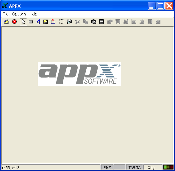
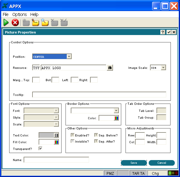
The Picture Properties overlay contains several fields that are used to define the characteristics of a picture.
Control Options
- Position indicates where the picture should appear inside the selected region. Click the list
 button for a drop-down list of selections that include CENTER, TOP, RIGHT, BOTTOM, LEFT, UPPER RIGHT, UPPER LEFT, LOWER RIGHT and LOWER LEFT.
 - Resource specifies the application and name of a resource defined in Named Resources which links to one or more graphics files. Different graphics can apply depending upon resource state (disabled, enabled, rollover, pressed, etc).
- Image Scale defines the size of this appearance of the graphic as a percentage of the normal graphic. Click the list button to make your choice.
- Margin (Top, Bottom, Left, Right) sets extra margin space between the picture and the border of the region. This value is in pixels and must be less than or equal to 255.
- Tooltip defines one line of help text that is displayed after the mouse pointer has been positioned over the picture for a few seconds. Tooltip does not apply to pictures on output and inquiry images.
Font Options
- Font
Is not a valid option when defining a picture and is disabled.
- Style
Is not a valid option when defining a picture and is disabled.
- Scale
Is not a valid option when defining a picture and is disabled.
- Text Color
Is not a valid option when defining a picture and is disabled.
- Fill Color
Defines the region’s fill color. Click the color icon to begin and see the Making Color Selections section for further instructions.
- Transparent?
Indicates whether or not the background of the region should be opaque or transparent.
Border Options
- Type
Defines the type of border that will surround the region. Click the list
button to make your choice.- Color defines
The color of the border. Click the color icon to begin and see the Making Color Selections section for further instructions.
Tab Order Options
- Tab Level
Is not a valid option when defining a picture and is disabled.
- Tab Group
Is not a valid option when defining a picture and is disabled.
Other Options
- Enabled
Is not a valid option when defining a picture and is disabled.
- Invisible
Indicates whether or not the picture is initially invisible when this image is first presented to the user. If "yes" then the picture must be made visible via ILF code in order for the user to see it. Click the checkbox to toggle between "yes"
 and "no"
  values.
- Sep. Before?
Is not a valid option when defining a picture and is disabled.
- Sep. After?
Is not a valid option when defining a picture and is disabled.
Micro Adjustments
- Row, Col, Height, and Width
Make slight adjustments to the size and position of the picture. They are entered as a percentage of an image cell (1 row x 1 column) and must be less than or equal to 100.
Finally,
- Name
Allows you to “name” the picture so it can be controlled (enabled, disabled, etc.) via ILF statements.
Access to the GUI attributes at runtime with ILF code is done via the --- WIDGET file. The WIDGET records from the process are copied into this file and are available in the Pre-Display event point. WIDGET NAME is a key to this file. You can read and rewrite records in this file to affect the GUI attributes at runtime.
When you have finished defining the picture you have two options available to you:
- Select the save option on the bottom right corner of the screen to save the definition and return to the Image Editor.
- Or, you can select the cancel option to discard the new definition or changes to an existing definition, and then return to the Image Editor.