APPX 5.5.0/5.5.1 Features - Application Design
This page describes the new features in Application Design in Release 5.5.0 and subsequent patch releases. Note that the features that include larger screens require a row/col setting of 35 x 144. If you are running at a lower screen size you will get the old versions of the screens. NOTES:- The .ENV GET SCREEN SIZE API was returning a row count three rows higher than the actual row setting. This bug has been fixed, so if you were manually compensating for this by subtracting 3 from the returned value, you no longer need to do this.
- The runtime processes for Disposition, Sort Order, Record Selection, etc. have been updated. If you have hooked these processes, make sure your hooks still work. You may want to consider reprogramming your hooks to take advantage of any new features, such as emailing a report.
- APPX 5.5.0/5.5.1 Features - Application Design
- Data API
- Multi Widget Editor
- Combined Item Edit
- GA/AA combined
- Documentation in HTML format
- Column headings & more in table widgets
- GA on Item list
- Standard copy/paste keys in Image Editor
- Optional Child/Rules accessible from button definition
- Lock design of file
- Comment block of code
- Show line numbers in ILF editor
- New ILF EXITREAD, SQL, DEL ALL
- New APIs
- Improved performance of Cross Reference Utilities
- Experimental New Process Maintenance for Inputs
- Beta Warning
- Comments
Data API
The Data API provides a set of tools you can use to have your APPX applications respond to web based queries. See this page for installation and configuration.Multi Widget Editor
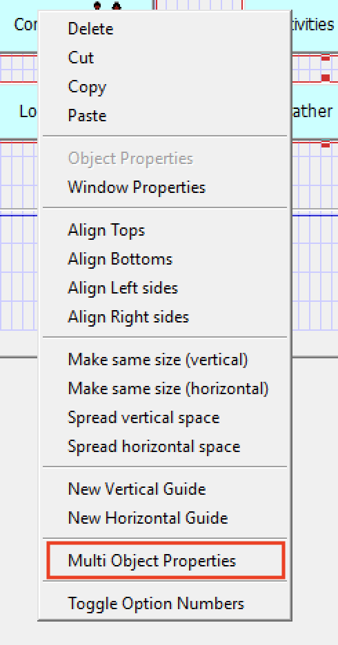
The Multi Widget Editor (MWE) allows you to edit the properties of multiple widgets at once. It is invoked while in the Image Editor, either via the toolbar icon or the right click menu:
 You may select one or more widgets before invoking MWE but it is not necessary to do so. Once invoked, you will see a display similar to this:
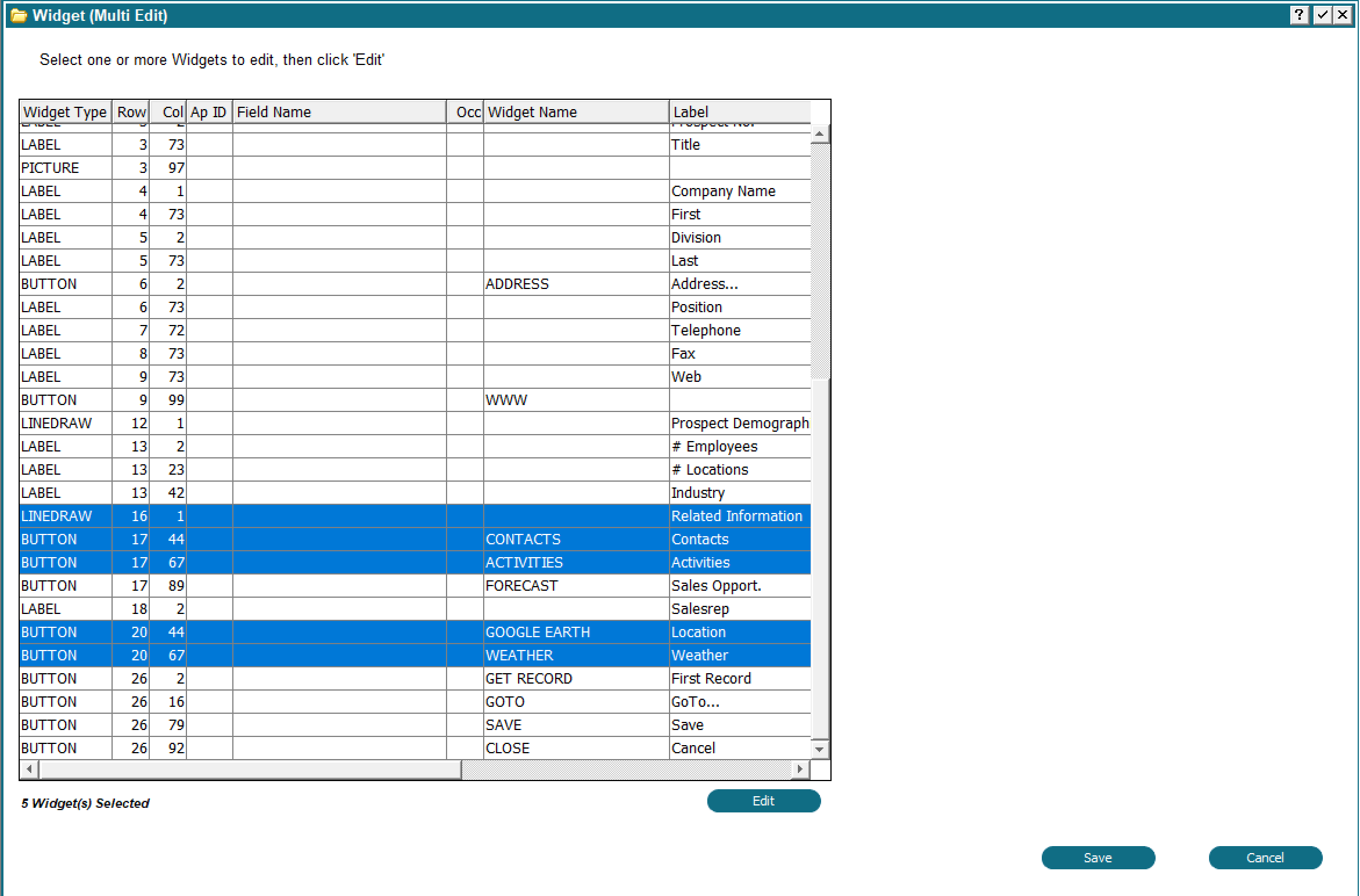 Any widgets you selected before invoking the MWE will be selected for you in the table. You can change your selection in the usual way, i.e. Control + Click to select additional widgets, Shift+Click to select a range, etc. You can also reorder the table by clicking the column heading. For example, you could group the widgets by type to get all the buttons together.
Note that if any items do not have a widget, one will be created with default values. Non-modifiable fields will get a LABEL widget, modifiable fields will get RAW TEXT, Date fields will get CLOCK/CALENDAR and so on.
To change widget properties, click the 'Edit' button. An Attribute table will appear beside the widget table:
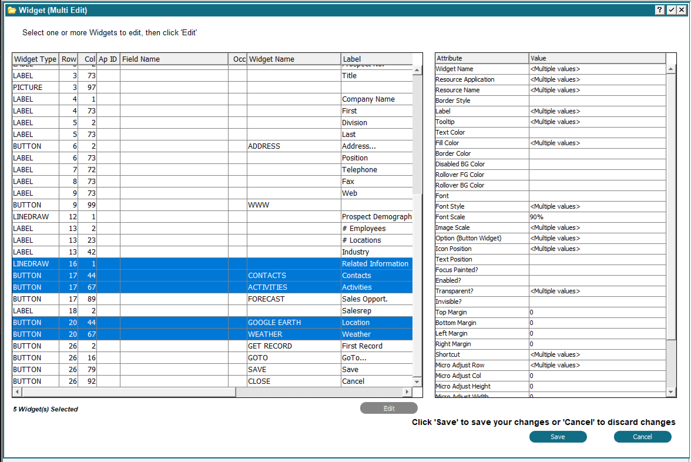 The list of Attributes will vary depending on which widgets you have selected. Beside each attribute is the value for the selected widgets. If the selected widgets have different values it will show <Multiple values>. If a single value is shown then all selected widgets have that value.
As long as one widget has a particular attribute it will show in the attribute table. To change an attribute just double click it. A dialog box will appear where you can enter the new value to be applied to all widgets. The dialog box content will vary depending on which attribute you selected. For example, if you double clicked 'Font' you would get a Font chooser or if you double clicked 'Text Color' you would get a color chooser and so on.
After you have made the desired changes click 'Save', or click 'Cancel' to discard all your changes. The Attribute table will disappear and the widget table will be available for you to select additional widgets. You can repeat this process of selecting widgets and changing attributes as many times as necessary. Only attributes that are applicable to the individual widgets will be updated. For example, if you selected LINEDRAW (Box) and BUTTON widgets, Box Label Location would appear in the list of attributes and you could change it. Since buttons do not have a Box Label Location, that setting would be ignored when updating the button widget.
When you are finished click 'Save' one more time to update your image with the changes or click 'Cancel' to discard all changes. You still need to click 'Save' in the Image Editor to save your changes to the design files as usual.
Combined Item Edit
The Item attributes of an Item in the Image Editor has been expanded to show all attributes of the Item. Previously, there were buttons for Data Lookup, Additional Attributes, GUI Attributes, etc. By combining all of these onto one image you can now set/change any Item attribute without having to click between different options. When changing an Item on an Image you will see a display similar to the following: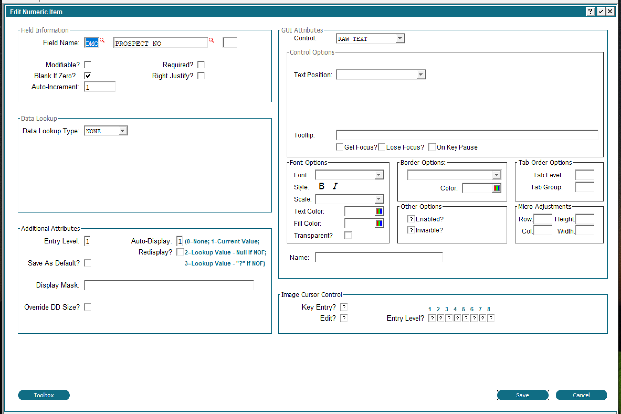 You may change any field without having to flip between multiple screens. The content you see here will vary depending on the type of field (Numeric, Alpha, etc.) and type of widget. If the Item did not have a widget APPX will automatically add one for you with default values.
Some character mode attributes have been deprecated or converted to Widget specifications:
 - Bright -> Sets the Font to BOLD
- Inverse -> Flips the background and foreground colors. If no colors were specified, then it will use a black background and white text.
- Foreground/Background Colors -> Converts to Text and Fill color with the following RGB values:
- BLACK -> #000000
- BLUE -> #0000FF
- CYAN -> #00FFFF
- DARK BLUE -> #6B238E
- DARK CYAN -> #408080
- DARK GRAY -> #404040
- DARK GREEN -> #2F4F2F
- DARK MAGENTA -> #8E236B
- DARK RED -> #8E2323
- GREEN -> #00FF00
- LIGHT GRAY -> #C0C0C0
- MAGENTA -> #FF00FF
- RED -> #FF0000
- WHITE -> #FFFFFF
- YELLOW -> #FFFF00
- Underline -> depcrecated
- Tabable -> deprecated
GA/AA combined
The GUI attributes and Additional Attributes at the Frame and Image levels have been combined. When clicking AA at the Frame or Image level, you will see a display similar to the following: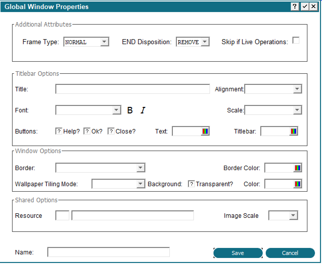 The contents will vary based on the type of process and type of frame or image. Changing any value from the default will turn on the 'AA' indicator at the Frame or Image level.
Documentation in HTML format
Documentation can now be entered and displayed in HTML format. To convert your existing Documentation to HTML run the 0AD job CONVERT DOCUMENT TO HTML: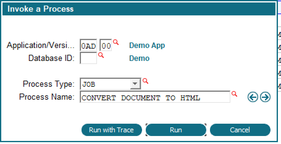 This can be invoked from within Application Design in any Application. An explanatory screen will be presented and you can choose to continue or cancel. If you continue all documentation in all applications will be converted to HTML. Since HTML can be longer than APPX plain text some documentation might be truncated. A report will be produced identifying these. This step might take some time to complete depending on the amount of documentation in your applications.
If you have some Applications that you do not want to convert, then you can either:
 - Temporarily delete them from the Applications file. This will not delete the Application itself and you can add the record back after conversion
- After the conversion restore the DOCUMENT.* files from backup for those applications
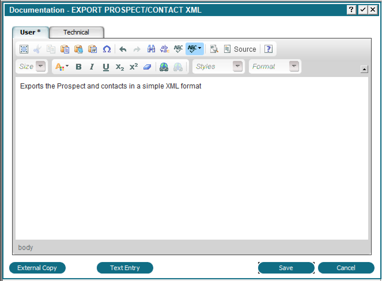 This input will default to either the HTML Editor or the plain text editor. It does this by looking at the existing text to determine if it is HTML or not. If you have run the conversion step above, it will default to HTML. If you have not run the conversion, it will default to the plain text editor. If you are adding new documentation, it will check existing documentation to determine if you are using HTML or not, and default accordingly. If this is a brand new application with no existing documentation, it will default to HTML. This approach allows you mix and match documentation format for situations where you have a mix of character and GUI applications.
The 'Text Entry' button switches to the normal, plain text Documentation entry screen. This will strip all the HTML from your text. It only preserves the line breaks and non-breaking spaces. Entities will be converted, if possible. On the plain text screen the button will show 'HTML Entry'. This will convert the plain text to HTML and display the HTML editor. APPX hard spaces (the underscore character) will be converted to, line breaks converted to <br /> and a pair of line breaks converted to <p>.
The HTML editor requires you to use the mouse to advance, and some designers find that annoying, so the automatic presentation of the Documentation screen when adding new objects has been turned off. If you want to enter Documentation while adding, you can use the Alt+D shortcut to call up the Documentation screen. If you want to restore the previous behaviour, set APPX_DOC_ON_ADD to any non blank value.
Column headings & more in table widgets
Column headings and cell properties can now be specified in the Table Source. There are 2 new buttons: Column Headings and Cell Properties. Column headings allows you to explicitly set the heading you want on a column as well as some formatting information. Cell properties allows you to set the properties of the cell. Both of these can be manipulated at runtime by updating the Widget file. When you click the 'Column Headings' button, you will see: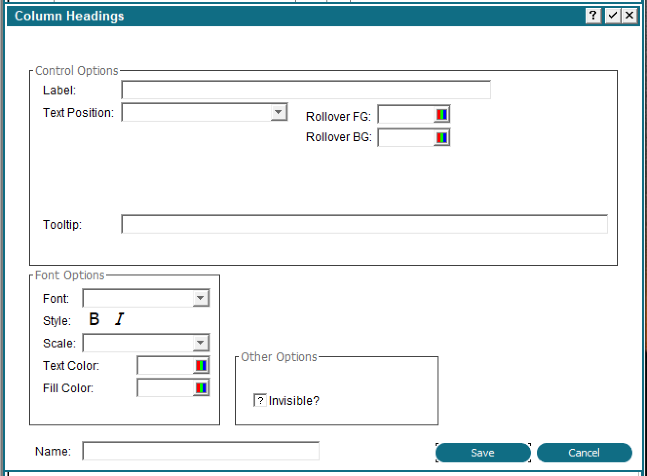 Only the Invisible and Label properties work on the Desktop (Java) client. The HTML client supports all properties.
 - Label: column header's label
- Tooltip: tooltip when hovering over the column
- Invisible: hides/shows the column
- Name: Assign a name if you want to be able to modify the widget properties in ILF
- Text Color
- Fill Color
- Font Name
- Font Style
- Font Scale
- Rollover Bg Color
- Rollover Fg Color
- Text position
- CLSS: assign classes to the column header
- TCS: Table column sortable. Valid values: T, F
- TCST: Table Column Sort Type. Valid values: INT, FLOAT, DATE, TEXT)
- TCR: Table Column resizable. Valid values: T, F
- TCSE: Table Column Searchable
- TCR: Table Column resizable. Valid values: T, F (This can be overridden at column level)
- TCS: Table column sortable. Valid values: T, F (This can be overridden at column level)
- TSMC: enable/disable column movement by mouse drag
- TSTS: Show/Hide table search icon. Valid values: T, F.
- TSTRF: Show/Hide table refresh icon. Valid values: T, F.
- TSHB: Show/Hids table column heading bar. Valid values T,F (Implemented: html client as of 5.5.0/Java client as of 5.5.1).
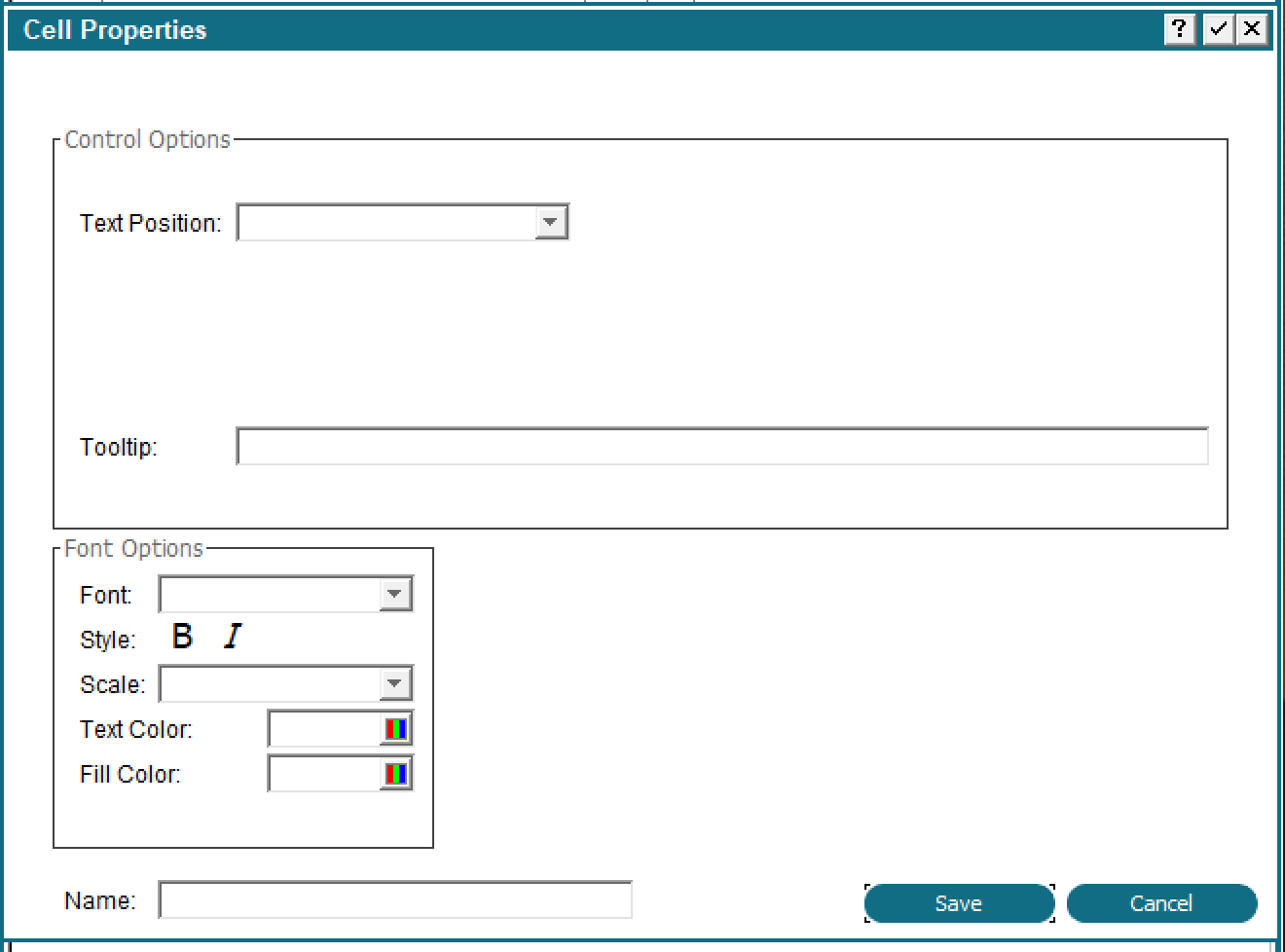 'Cell Properties' allows you to set the properties on an individual cell in a table. This is only supported on the HTML client, the Desktop client will ignore them.
When specifying a table on an image you can also specify a caption for the table (HTML Client only):
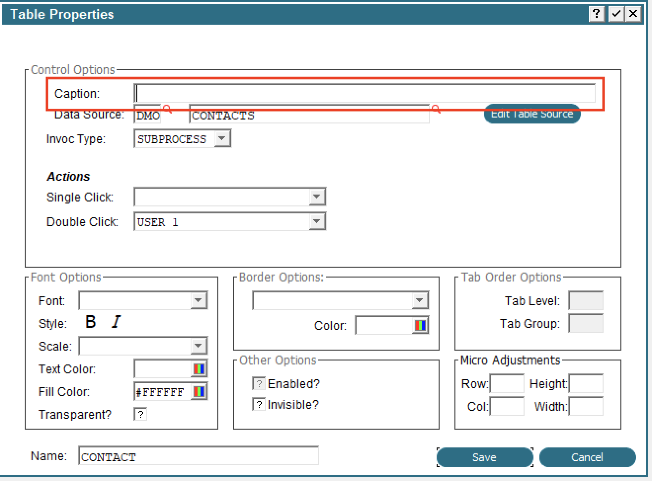 For an example of modifying a table dynamically, run the PROSPECTS WITH MODIFIABLE COL Input in Application DMO.
GA on Item list
GUI Attributes are now accessible from the Item List in the Image Editor. When you press F11 (Inquire) in the Image Editor, you will get the usual display of items on the image and now each one will have a GA button to access the GUI attributes for that Item: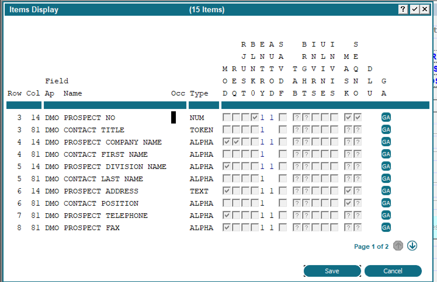
Standard copy/paste keys in Image Editor
In the Image Editor, you can use the standard keyboard shortcut Control+C to copy and Control+V to paste. It is not necessary to use the right click menu for copy/paste although those options are still there.Optional Child/Rules accessible from button definition
When defining a button on an image you can now directly access the Option Intercept event point and the Optional Children list. This makes it easier to define the actions that should be taken when the button is pressed.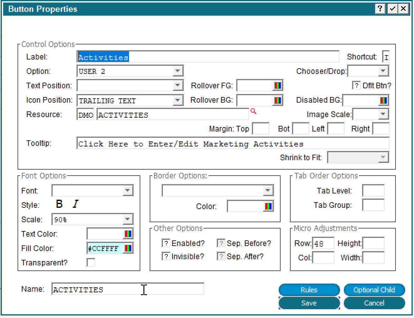 The 'Rules' button will display all the Event Points for the current Image and the 'Optional Child' button will take you directly to the Optional Child specified by the 'Option' (Optional Child 2 in this example). There is also a 'Children' button on the toolbar which will take you to all Optional Children:

Lock design of file
You can now lock the design of a file. The new flag is located under 'Additional Attributes':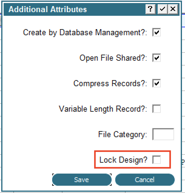 Once the design is locked no changes to the file are allowed and any Domains that are used in this file are also locked. In other words, if you try to change a Domain that is used in a locked design you will get an error message and the change will not be allowed.
Comment block of code
You now have the ability to comment a block (or single line) of code without disturbing the T/F flags. To comment a block of code, select it in the usual way (Option 7). The 'Comment', 'Uncomment' options will appear at the bottom of the screen along with Copy, Delete, etc. Commented code will be displayed in green as usual: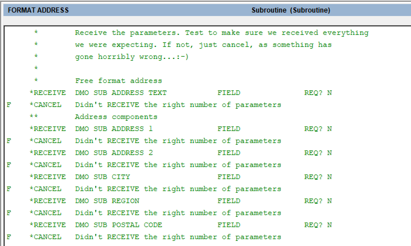 The asterisk to the left of the ILF verb also indicates that the line is a comment. In character mode only the asterisk is displayed since there is no color support. Notice that the T/F flags are preserved. To uncomment a block select the range as before and click 'Uncomment'.
Note that this feature is not compatible with previous releases. Earlier releases will not recognize the lines are commented and will execute them normally.
Show line numbers in ILF editor
You now have the ability to show statement line numbers in the ILF editor as well as the ability to jump to a specific line. To display the line number use Option 98 and then click 'Show Line Numbers'. There is also a new 'Jump' button which allows you to navigate directly to a line number. To use it just click the 'Jump' button and enter the line number you want to go to.New ILF EXITREAD, SQL, DEL ALL
Some new ILF commands have been added. Note that these are not compatible with previous releases and any process using these commands will fail to compile.DEL ALL
This command will simply delete all the records in the specified file. The only parameter is the name of the file. You can use this in place of SCRATCH/CREATE. A SCRATCH command will fail if the specified file is in use but DEL ALL will still run and delete the records (unless another user has a lock on a record in which case you will get the usual 'Waiting for lock...' message). If the file has a large number of records there might be delay before all the records are deleted.EXITREAD
This command can be used to 'break out' of a BEG READ/END READ loop. Execution will resume at the next statement after the associated END READ. For example: SET --- XI =
BEG READ DMO PROSPECT HOLD 0 KEY IS PROSPECT NO
IF DMO PROSPECT EMPLOYEES GT 100
T SET --- XI = 1
T EXITREAD DMO PROSPECT
END READ DMO PROSPECT
IF --- XI EQ 0
T ERROR Did not find any
F MESSAGE Found one!
When a PROSPECT record with over 100 employees is found the flag is turned on, the EXITREAD command is executed and control is transferred to the statement immediately after the END READ.
SQL
The SQL statement allows you to execute an arbitrary SQL command and get the results. You supply a file name and the name of a field containing a valid SQL command. Results will be returned in the specified file. For example: SET --- TEMP 512 = SELECT * FROM
APPEND --- TEMP 512 1 DMO_DMO_PROSPECT WHERE
APPEND --- TEMP 512 1 PROSPECT_EMPLOYEES >
APPEND --- TEMP 512 1 100
SQL DMO PROSPECT --- TEMP 512
BEG READ DMO PROSPECT HOLD 0 KEY IS PROSPECT NO
DISPLAY DMO PROSPECT EMPLOYEES (AT APPEARANCE # )
END READ DMO PROSPECT
Although it looks like the results will replace the permanent disk DMO PROSPECT file, APPX only updates the cached version of the file and opens it for you. The BEG READ statement will use the cached version. This approach allows you to use the name of existing files to get results instead of creating new files just for that purpose.
You can send any SQL statement, including UPDATE or INSERT INTO, etc. If you update a table you need to do a explicit commit using (COMMIT statement) afterward.
If you send a statement with no reply, such as an UPDATE statement, the SQL statement will still open a cached version of the indicated file. In this case, a READNEXT on the file would fail but the SQL statement still gets executed. If you do a commit you should see your changes in the database.
The SQL statement can only operate on files stored in a RDBMS, and only indexed files can be stored there, so memory, one record and consecutive files wil not work with this command.
The SQL statement uses the FMS group associated with the named file to connect to the RDBMS.
Currently, APPX ignores errors or returned values from server. Make sure your SQL is valid when using this command.
New APIs
A number of new APIs have been added:- Set file specifications - https://wiki.appx.com/wiki/bin/view/Main/0LASubrFileSetSpecs
- Archive security codes - https://wiki.appx.com/wiki/bin/view/Main/0LASubrUtilSecrSave
- Restore security codes - https://wiki.appx.com/wiki/bin/view/Main/0LASubrUtilSecrRest
- Convert HTML to text - https://wiki.appx.com/wiki/bin/view/Main/0LASubrConvertHtmlToText
- Send an Email - https://wiki.appx.com/wiki/bin/view/Main/0LASubrUtilEmail
Improved performance of Cross Reference Utilities
The cross reference routines have been rewritten for improved performance.Experimental New Process Maintenance for Inputs
We are experimenting with a new interface for Application Design. If you set APPX_EXPERIMENTAL_PROCESS_DESIGN=true, then a new option will appear on the Application Design menu. While functional, it does not do everything the normal process design allows, i.e., you cannot add new processes or delete existing ones. We are releasing it here as an experimental feature to get some feedback and suggestions. To send us feedback on this feature, email ' feedback@appx.com'. If the environment variable is enabled you will see the new option as below: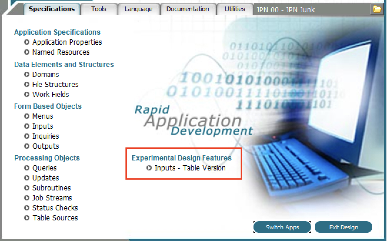 The current implementation for process design requires you to continually navigate from Processes -> Frames -> Images and back which is time consuming. The new Table driven version allows you navigate directly from the Image level in one process to the Image level in a different process.
When you click that option you will see a display similar to this:
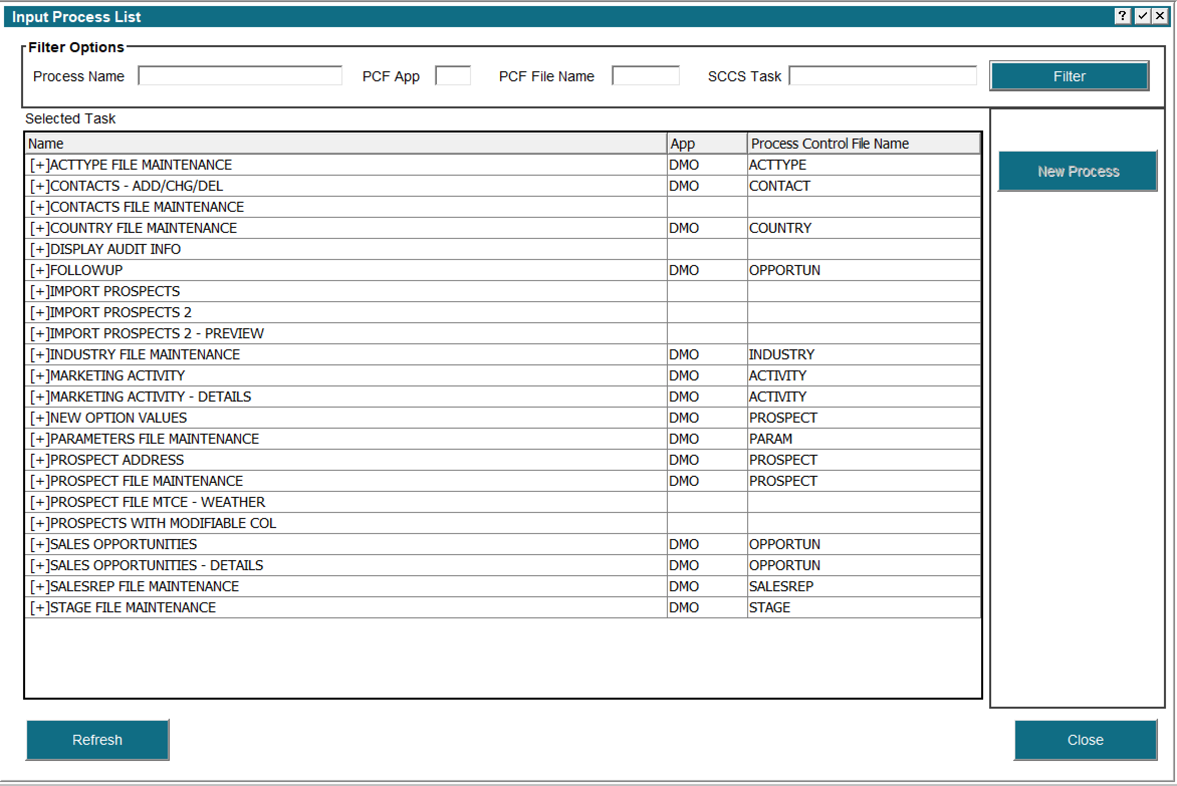 The Process Name, PCF App and PCF File Name all act as filters. For example, entering 'PROS' in the Process Name and clicking the 'Filter' button will redisplay the list showing only those processes that have 'PROS' somewhere in the name. PCF App and PCF File Name work the same way. This is an easy way to restrict the list to related processes. The 'SCCS Task' filter is not yet enabled.
A single click on any process will display the Additional Attributes, Rules, Documentation and Security buttons in the right hand pane:
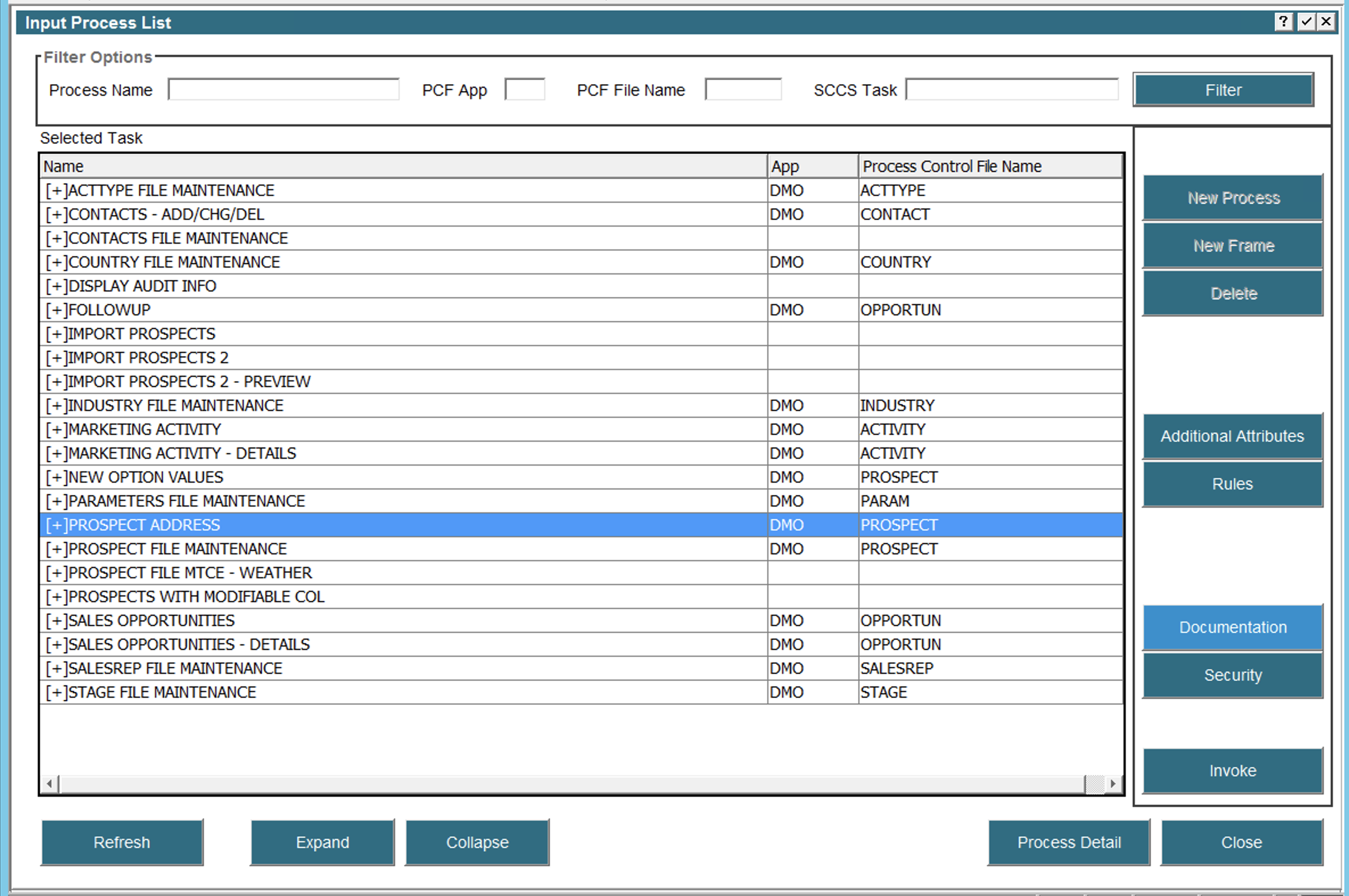 Double clicking a process will allow you to edit that process using the original design input process. From there, you can navigate to the Frame and Image level as usual.
The other way to navigate to a frame or image is to click the 'Expand' button on the bottom. This will expand the selected process, or processes, if you have selected more than one, and show all the frames and images:
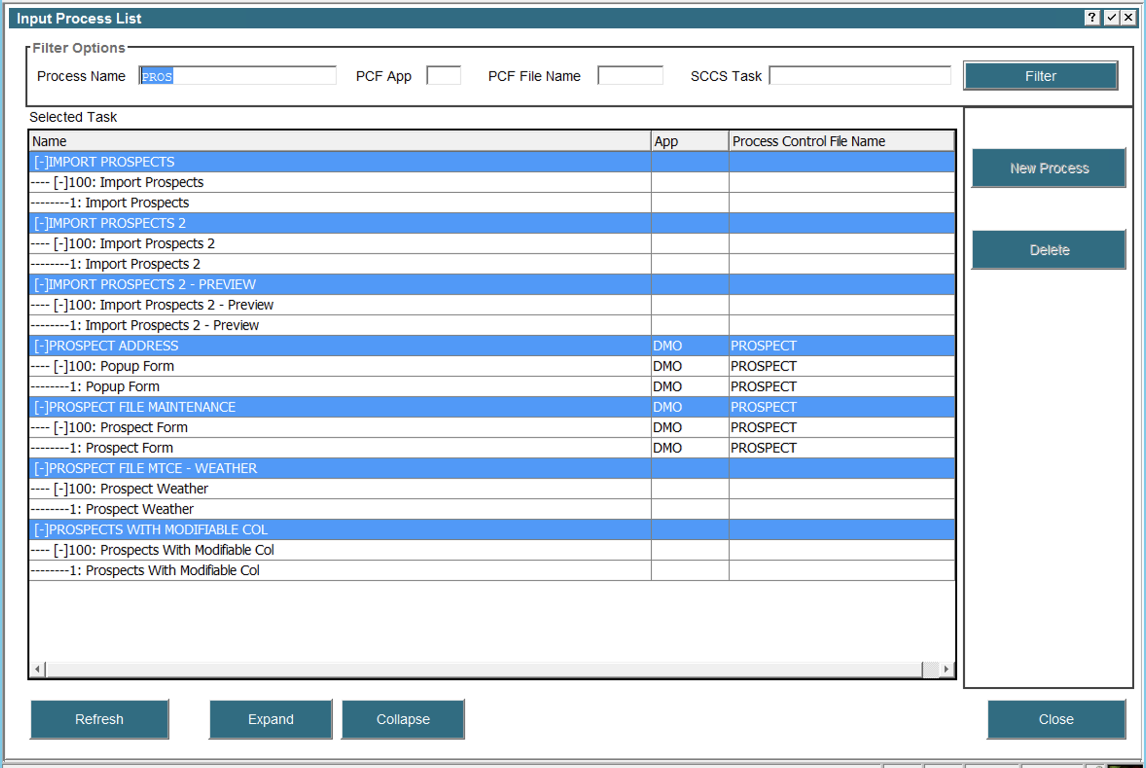 In this example I have used 'PROS' as a filter to only show inputs related to the Prospect file and I have expanded all of them. Now I can navigate directly to any Frame or Image via double click. A single click on any row will display the appropriate buttons in the right hand pane, i.e., if I single click an Image then an 'Image Editor' button will appear. Similarly, a single click on a Frame will display buttons for Automatic Children and so on.
We welcome any suggestions on improving this interface.
Beta Warning
To ensure users know they're running a 'beta' (pre-release) version of the APPX engine, a warning message will be displayed on the splash screen of their GUI client reminding them of that usage. If desired, this behavior can be overridden (the splash screen message suppressed) by setting the new environment variable 'APPX_NO_BETA_WARNING'. (Implemented: 5.5.1) -- BrianRyan - 2020-07-06Comments
Ideas, requests, problems regarding TWiki? Send feedback

