Difference: Appx550FeaturesAppDesign (3 vs. 4)
Revision 42020-02-21 - BredaHennessy
| Line: 1 to 1 | ||||||||
|---|---|---|---|---|---|---|---|---|
APPX 5.5.0 Features - Application Design | ||||||||
| Changed: | ||||||||
| < < | This page describes the new features in Application Design in Release 5.5.0. Note that the features that include larger screens require a row/col setting of 35 x 144. If you are running at a lower screen size, you will get the old versions of the screens. | |||||||
| > > | This page describes the new features in Application Design in Release 5.5.0. Note that the features that include larger screens require a row/col setting of 35 x 144. If you are running at a lower screen size you will get the old versions of the screens. | |||||||
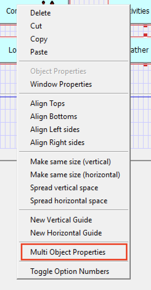
Multi Widget Editor | ||||||||
| Changed: | ||||||||
| < < | The Multi Widget Editor (MWE) allows you to edit the properties of multiple widgets at once. It is invoked while in Image Editor, either via the toolbar icon or the right click menu: | |||||||
| > > | The Multi Widget Editor (MWE) allows you to edit the properties of multiple widgets at once. It is invoked while in the Image Editor, either via the toolbar icon or the right click menu: | |||||||

 | ||||||||
| Changed: | ||||||||
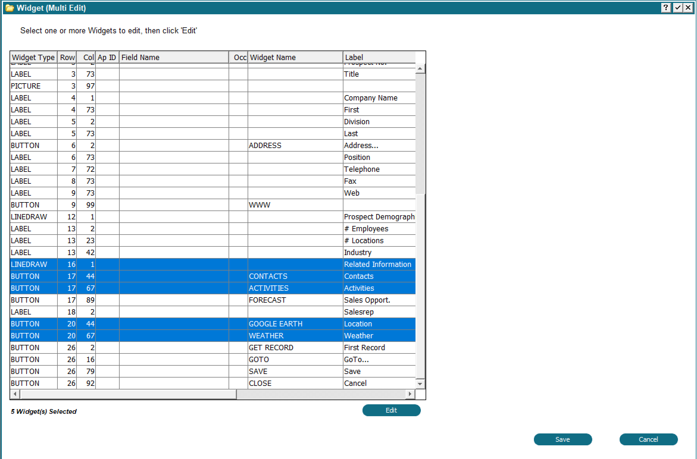
| < < | You may select one or more widgets before invoking MWE, but it is not necesary to do so. Once invoked, you will see a display similar to this: | |||||||
| > > | You may select one or more widgets before invoking MWE but it is not necessary to do so. Once invoked, you will see a display similar to this: | |||||||
 | ||||||||
| Changed: | ||||||||
| < < | Any widgets you selected before invoking the MWE will be selected for you in the table. You can change your selection in the usual way, ie, Control + Click to select additional widgets, Shift+Click to select a range, etc. You can also reorder the table by clicking the column heading. For example, you could group the widgets by type to get all the buttons together. | |||||||
| > > | Any widgets you selected before invoking the MWE will be selected for you in the table. You can change your selection in the usual way, i.e. Control + Click to select additional widgets, Shift+Click to select a range, etc. You can also reorder the table by clicking the column heading. For example, you could group the widgets by type to get all the buttons together. | |||||||
| Changed: | ||||||||
| < < | Note that if any items do not have a widget, one will be created with default values. Non modifiable fields will get a LABEL widget, modifiable fields will get RAW TEXT, Date fields will get CLOCK/CALENDAR and so on. | |||||||
| > > | Note that if any items do not have a widget, one will be created with default values. Non-modifiable fields will get a LABEL widget, modifiable fields will get RAW TEXT, Date fields will get CLOCK/CALENDAR and so on. | |||||||
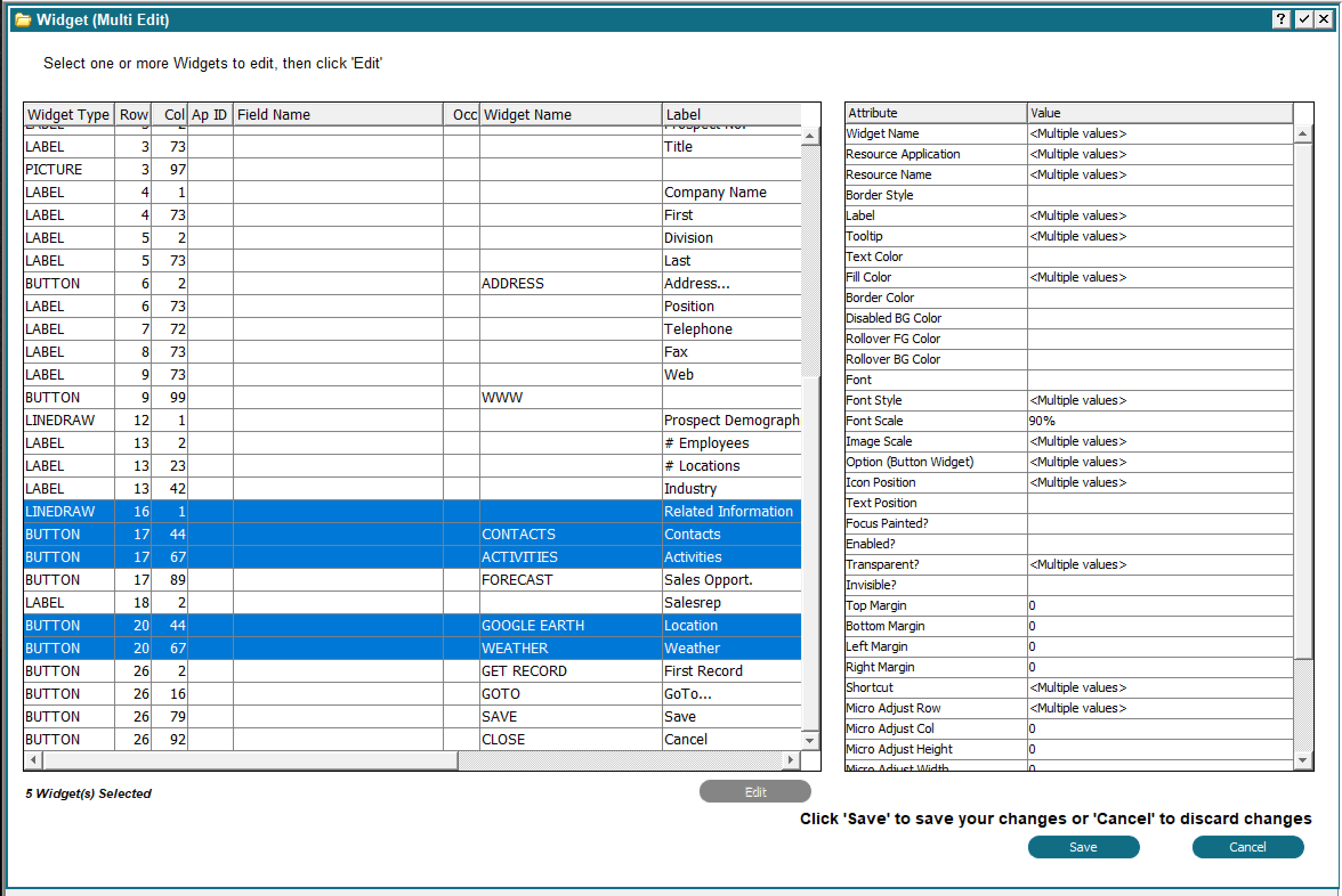
To change widget properties, click the 'Edit' button. An Attribute table will appear beside the widget table:
 | ||||||||
| Changed: | ||||||||
| < < | The list of Attributes will vary, depending on which widgets you have selected. Beside each attribute is the value for the selected widgets. If the selected widgets have different values, it will show <Multiple values>. If a single value is shown, then all selected widgets have that value. | |||||||
| > > | The list of Attributes will vary depending on which widgets you have selected. Beside each attribute is the value for the selected widgets. If the selected widgets have different values it will show <Multiple values>. If a single value is shown then all selected widgets have that value. | |||||||
| Changed: | ||||||||
| < < | As long as one widget has a particular attribute, it will show in the attribute table. To change an attribute, just double click it. A dialog box will appear where you can enter the new value to be applied to all widgets. The dialog box content will vary depending on which attribute you selected. For example, if you double clicked 'Font', you would get a Font chooser, or if you double clicked 'Text Color' you would get a color chooser, and so on. | |||||||
| > > | As long as one widget has a particular attribute it will show in the attribute table. To change an attribute just double click it. A dialog box will appear where you can enter the new value to be applied to all widgets. The dialog box content will vary depending on which attribute you selected. For example, if you double clicked 'Font' you would get a Font chooser or if you double clicked 'Text Color' you would get a color chooser and so on. | |||||||
| Changed: | ||||||||
| < < | After you have made the desired changes, click 'Save', or click 'Cancel' to discard all your changes. The Attribute table will disappear and the widget table will be available for you to select additional widgets. You can repeat this process of selecting widgets and changing attributes as many times as necessary. Only attributes that are applicable to the individual widgets will be updated. For example, if you selected LINEDRAW (Box) and BUTTON widgets, Box Label Location would appear in the list of attributes and you could change it. Since buttons do not have a Box Label Location, that setting would be ignored when updating the button widget. | |||||||
| > > | After you have made the desired changes click 'Save', or click 'Cancel' to discard all your changes. The Attribute table will disappear and the widget table will be available for you to select additional widgets. You can repeat this process of selecting widgets and changing attributes as many times as necessary. Only attributes that are applicable to the individual widgets will be updated. For example, if you selected LINEDRAW (Box) and BUTTON widgets, Box Label Location would appear in the list of attributes and you could change it. Since buttons do not have a Box Label Location, that setting would be ignored when updating the button widget. | |||||||
| Changed: | ||||||||
| < < | When you are finished, click 'Save' one more time to update your image with the changes, or click 'Cancel' to discard all changes. You still need to click 'Save' in the Image Editor to save your changes to the design files, as usual. | |||||||
| > > | When you are finished click 'Save' one more time to update your image with the changes or click 'Cancel' to discard all changes. You still need to click 'Save' in the Image Editor to save your changes to the design files as usual. | |||||||
Combined Item Edit | ||||||||
| Changed: | ||||||||
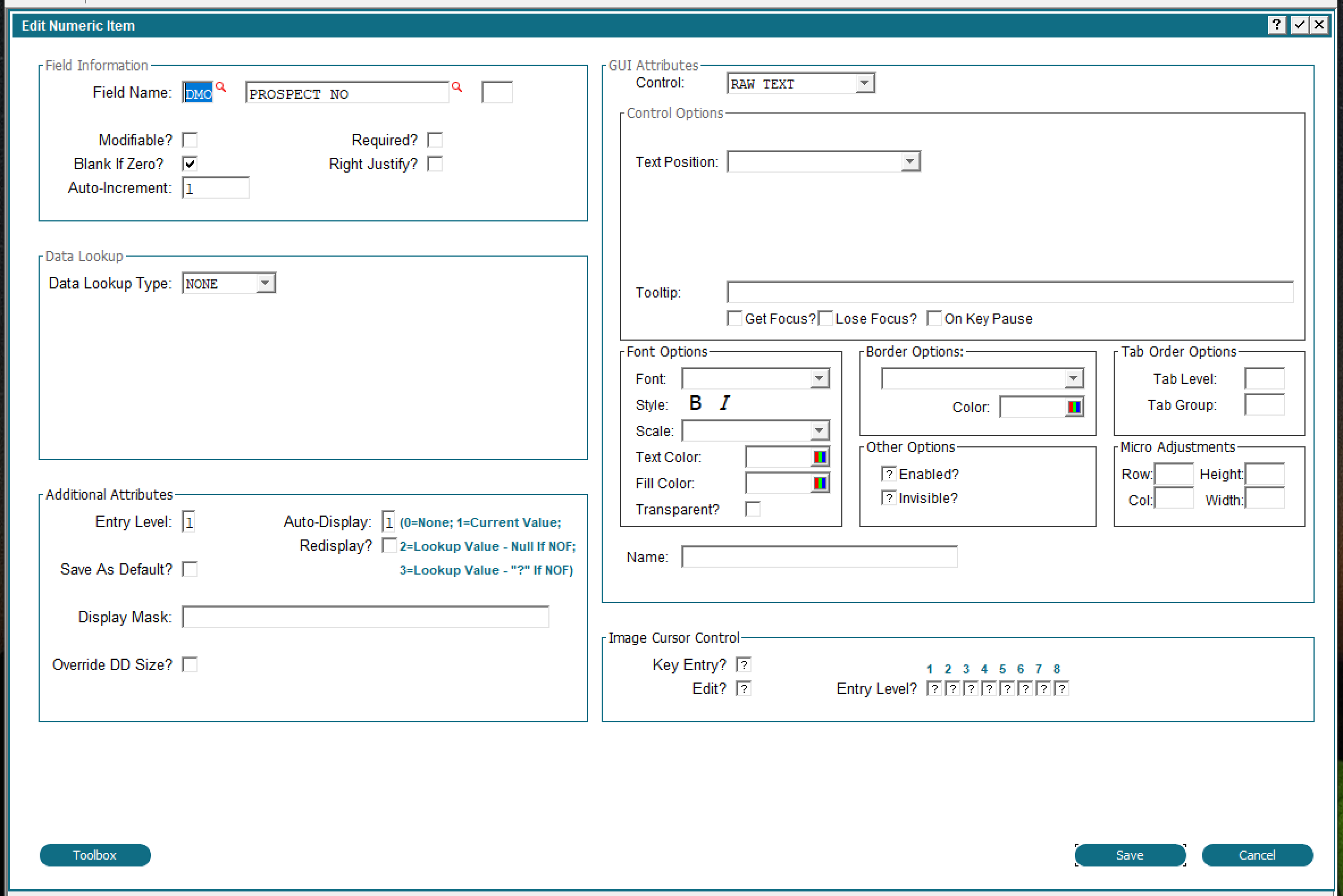
| < < | The Item attributes of an Item in the Image Editor has been expanded to show all attributes of the Item. Previously, there were buttons for Data Lookup, Additional Attributes, GUI Attributes, etc. By combining all of these onto one image, you can now set / change any Item attribute without having to click between different options. When changing an Item on an Image, you will see a display similar to the following: | |||||||
| > > | The Item attributes of an Item in the Image Editor has been expanded to show all attributes of the Item. Previously, there were buttons for Data Lookup, Additional Attributes, GUI Attributes, etc. By combining all of these onto one image you can now set/change any Item attribute without having to click between different options. When changing an Item on an Image you will see a display similar to the following: | |||||||
 | ||||||||
| Changed: | ||||||||
| < < | You may change any field without having to flip between multiple screens. The content you see here will vary depending on the type of field (Numeric, Alpha, etc) and type of widget. If the Item did not have a widget APPX will automatically add one for you with default values. | |||||||
| > > | You may change any field without having to flip between multiple screens. The content you see here will vary depending on the type of field (Numeric, Alpha, etc.) and type of widget. If the Item did not have a widget APPX will automatically add one for you with default values. | |||||||
GA/AA combinedThe GUI attributes and Additional Attributes at the Frame and Image levels have been combined. When clicking AA at the Frame or Image level, you will see a display similar to the following: | ||||||||
| Line: 48 to 48 | ||||||||
The contents will vary based on the type of process and type of frame or image. Changing any value from the default will turn on the 'AA' indicator at the Frame or Image level.
Documentation in HTML format | ||||||||
| Changed: | ||||||||
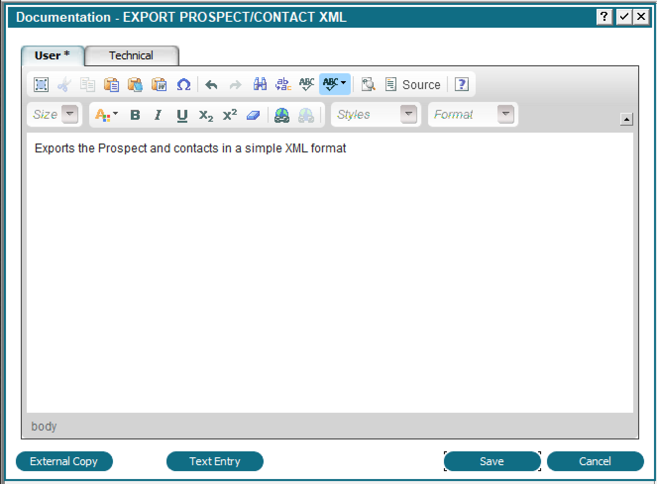
| < < | Documentation can now be entered and displayed in HTML format. When you click the 'Documentation' button, you will see a display similar to the following: | |||||||
| > > | Documentation can now be entered and displayed in HTML format. When you click the 'Documentation' button you will see a display similar to the following: | |||||||
 | ||||||||
| Changed: | ||||||||
| < < | The 'Text Entry' button replaces the toolbar with a simplified toolbar that only supports plain text. If you need to maintain compatibility with plain text, you can use this button to prevent HTML from being entered. | |||||||
| > > | The 'Text Entry' button replaces the toolbar with a simplified toolbar that only supports plain text. If you need to maintain compatibility with plain text you can use this button to prevent HTML from being entered. | |||||||
| Changed: | ||||||||
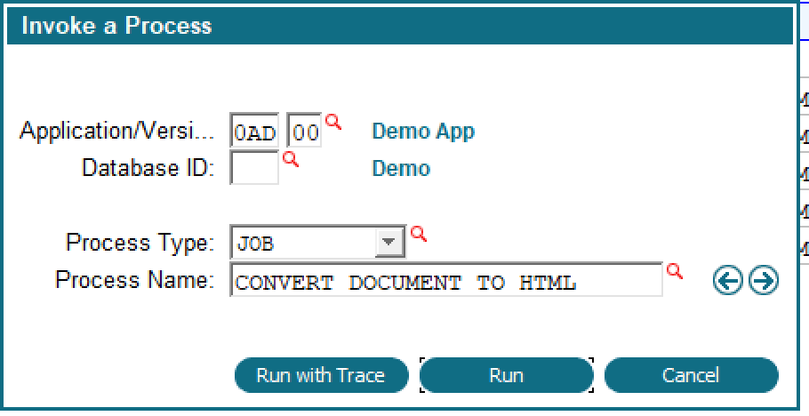
| < < | To convert your existing Documentation to HTML, run job CONVERT DOCUMENT TO HTML: | |||||||
| > > | To convert your existing Documentation to HTML run the 0AD job CONVERT DOCUMENT TO HTML: | |||||||
 | ||||||||
| Changed: | ||||||||
| < < | An explanatory screen will be presented and you can choose to continue or cancel. If you continue, all documentation in all applications will be converted to HTML. Since HTML can be longer than APPX plain text, some documentation might be truncated. A report will be produced identifying these. | |||||||
| > > | An explanatory screen will be presented and you can choose to continue or cancel. If you continue all documentation in all applications will be converted to HTML. Since HTML can be longer than APPX plain text some documentation might be truncated. A report will be produced identifying these. | |||||||
Column headings & more in table widgets | ||||||||
| Changed: | ||||||||
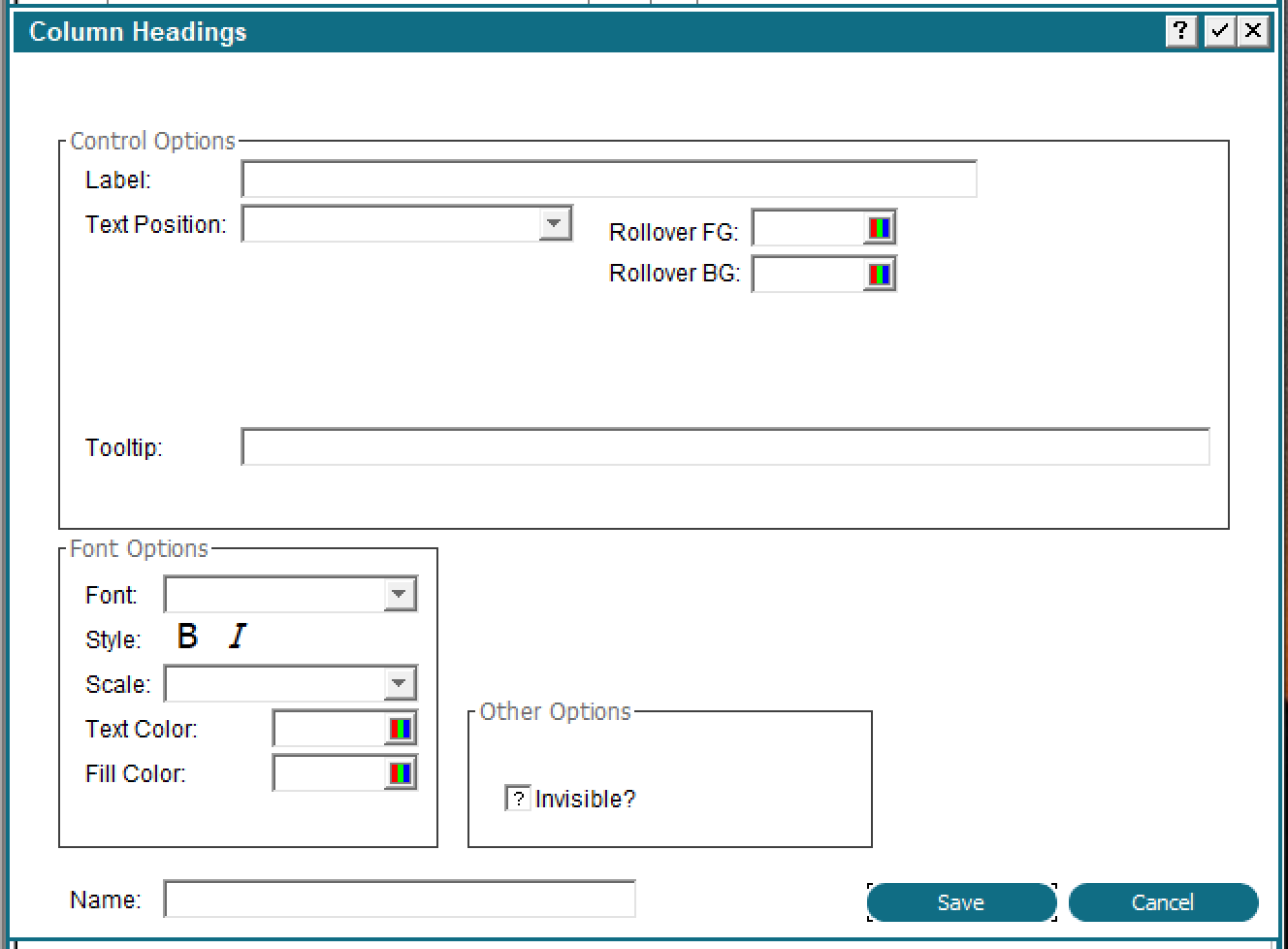
| < < | Column headings and cell properties can now be specified in the Table Source. There are 2 new buttons: Column Headings and Cell Properties. Column headings allows you to explicitly set the heading you want on a column, as well as some formatting information. Cell properties allows you to set the properties of the cell. Both of these can be manipulated at runtime via updating the Widget file. | |||||||
| > > | Column headings and cell properties can now be specified in the Table Source. There are 2 new buttons: Column Headings and Cell Properties. Column headings allows you to explicitly set the heading you want on a column as well as some formatting information. Cell properties allows you to set the properties of the cell. Both of these can be manipulated at runtime by updating the Widget file. | |||||||
When you click the 'Column Headings' button, you will see:
 | ||||||||
| Changed: | ||||||||
| < < | Only the Invisible and Label properties work on the Desktop (Java) client. The HTML client supports all the properties. | |||||||
| > > | Only the Invisible and Label properties work on the Desktop (Java) client. The HTML client supports all properties. | |||||||
| ||||||||
| Changed: | ||||||||
| < < |
| |||||||
| > > |
| |||||||
| ||||||||
| Line: 80 to 80 | ||||||||
| ||||||||
| Changed: | ||||||||
| < < | If you want to modify the column widgets, you must do it in start of process of the Table Source. You can also add macros to the label or tooltip field of the column widgets. | |||||||
| > > | If you want to modify the column widgets you must do it in the Start of Process EP of the Table Source. You can also add macros to the label or tooltip field of the column widgets. | |||||||
Supported Macros for table column widgets:
| ||||||||
| Line: 100 to 100 | ||||||||
| 'Cell Properties' allows you to set the properties on an individual cell in a table. This is only supported on the HTML client, the Desktop client will ignore them. | ||||||||
| Changed: | ||||||||
| < < | When specifying a table on an image, you can also specify a caption for the table (HTML Client only): | |||||||
| > > | When specifying a table on an image you can also specify a caption for the table (HTML Client only): | |||||||
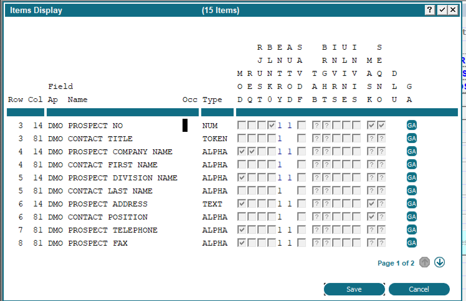
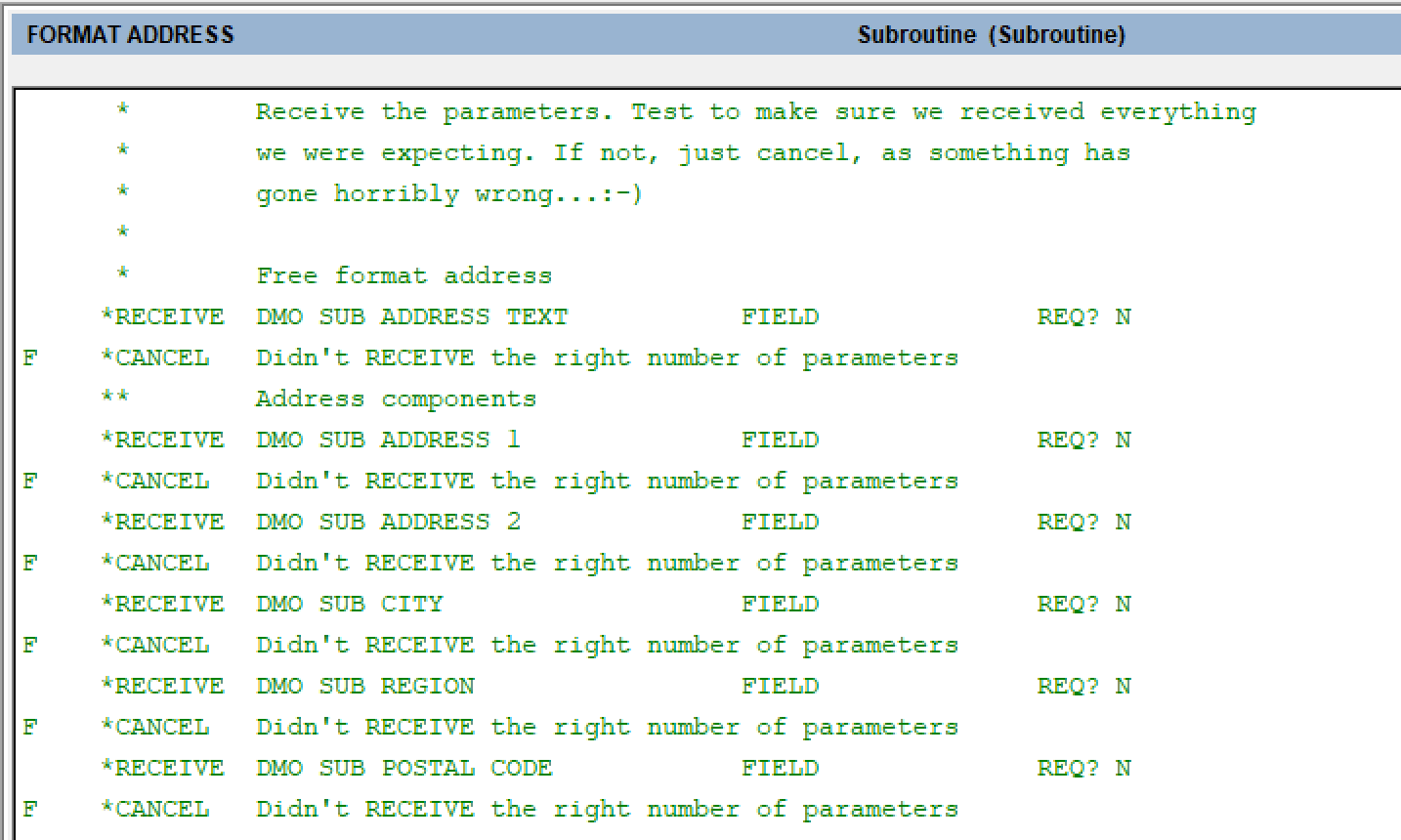
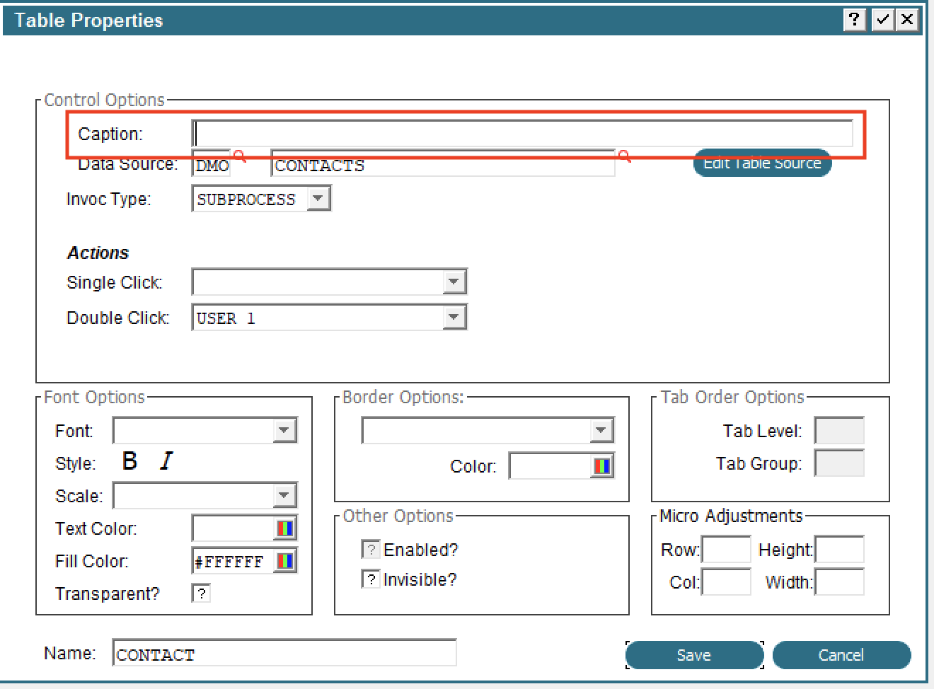 For an example of modifying a table dynamically, run the PROSPECTS WITH MODIFIABLE COL Input in Application DMO.
GA on Item list | ||||||||
| Changed: | ||||||||
| < < | GUI Attributes are now accessible from the Item List in the Image Editor. When you press F11 (Inquire) in the Image Editor, you will get the usual display of items on the image, and now each one will have a GA button to access the GUI attributes for that Item: | |||||||
| > > | GUI Attributes are now accessible from the Item List in the Image Editor. When you press F11 (Inquire) in the Image Editor, you will get the usual display of items on the image and now each one will have a GA button to access the GUI attributes for that Item: | |||||||
Standard copy/paste keys in Image Editor | ||||||||
| Changed: | ||||||||
| < < | In the Image Editor, you can use the standard keyboard shortcut Control+C to copy and Control+V to paste. It is not necessary to use the right click menu for copy/paste, although those options are still there. | |||||||
| > > | In the Image Editor, you can use the standard keyboard shortcut Control+C to copy and Control+V to paste. It is not necessary to use the right click menu for copy/paste although those options are still there. | |||||||
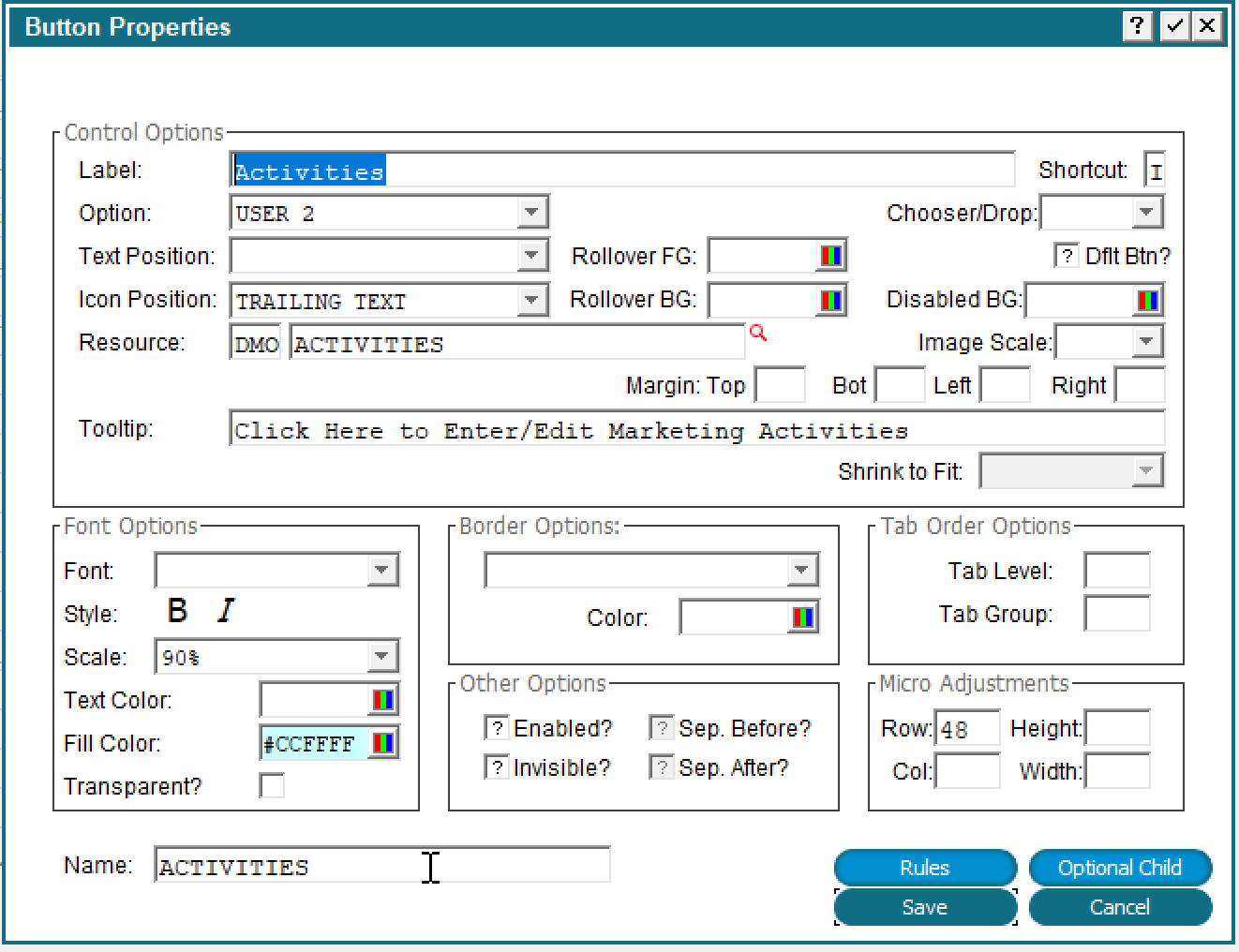
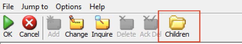
Optional Child/Rules accessible from button definition | ||||||||
| Changed: | ||||||||
| < < | When defining a button on an image, you can now directly access the Option Intercept event point and the Optional Children list. This makes it easier to define the actions that should be taken when the button is pressed. | |||||||
| > > | When defining a button on an image you can now directly access the Option Intercept event point and the Optional Children list. This makes it easier to define the actions that should be taken when the button is pressed. | |||||||
 | ||||||||
| Changed: | ||||||||
| < < | The 'Rules' button will display all the Event Points for the current Image and the 'Optional Child' button will you directly to the Optional Child specified by the 'Option' (Optional Child 2 in this example). There is also a 'Children' button in the toolbar which will take you all Optional Children: | |||||||
| > > | The 'Rules' button will display all the Event Points for the current Image and the 'Optional Child' button will take you directly to the Optional Child specified by the 'Option' (Optional Child 2 in this example). There is also a 'Children' button on the toolbar which will take you to all Optional Children: | |||||||
Lock design of file | ||||||||
| Line: 128 to 128 | ||||||||
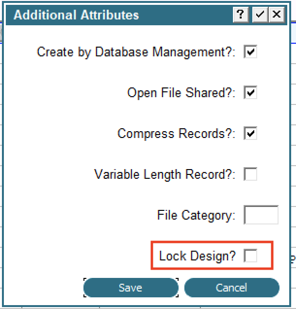 | ||||||||
| Changed: | ||||||||
| < < | Once the design is locked no changes to the file are allowed and any Domains that are used in this file are also locked. In other words, if you try to change a Domain that is used in a locked design, you will get an error message and the change will not be allowed. | |||||||
| > > | Once the design is locked no changes to the file are allowed and any Domains that are used in this file are also locked. In other words, if you try to change a Domain that is used in a locked design you will get an error message and the change will not be allowed. | |||||||
Comment block of code | ||||||||
| Changed: | ||||||||
| < < | You now have the ability to comment a block (or single line) of code without disturbing the T/F flags. To comment a block of code, select it in the usual way (Option 7). The 'Comment', 'Uncomment' options will appear at the bottom of the screen along with Copy, Delete, etc. Commented code will be displayed in green, as usual: | |||||||
| > > | You now have the ability to comment a block (or single line) of code without disturbing the T/F flags. To comment a block of code, select it in the usual way (Option 7). The 'Comment', 'Uncomment' options will appear at the bottom of the screen along with Copy, Delete, etc. Commented code will be displayed in green as usual: | |||||||
 | ||||||||
| Changed: | ||||||||
| < < | The asterisk to the left of the ILF verb also indicates the line is a comment. In character mode only the asterisk is displayed since there is no color support. Notice that the T/F flags are preserved. To uncomment a block, select the range as before and click 'Uncomment'. | |||||||
| > > | The asterisk to the left of the ILF verb also indicates that the line is a comment. In character mode only the asterisk is displayed since there is no color support. Notice that the T/F flags are preserved. To uncomment a block select the range as before and click 'Uncomment'. | |||||||
Note that this feature is not compatible with previous releases. Earlier releases will not recognize the lines are commented and will execute them normally.
Show line numbers in ILF editor | ||||||||
| Changed: | ||||||||
| < < | You now have the ability to show statement line numbers in the ILF editor, as well as the ability to jump to a specific line. To display the line number, use Option 98, then click 'Show Line Numbers'. There is also a new 'Jump' button which allows you to navigate directly to a line number. To use it, just click the 'Jump' button and enter the line number you want to go to. | |||||||
| > > | You now have the ability to show statement line numbers in the ILF editor as well as the ability to jump to a specific line. To display the line number use Option 98 and then click 'Show Line Numbers'. There is also a new 'Jump' button which allows you to navigate directly to a line number. To use it just click the 'Jump' button and enter the line number you want to go to. | |||||||
New ILF EXITREAD, SQL, DEL ALLSome new ILF commands have been added. Note that these are not compatible with previous releases and any process using these commands will fail to compile.DEL ALL | ||||||||
| Changed: | ||||||||
| < < | This command will simply delete all the records in the specified file. The only parameter is the name of the file. You can use this in place of SCRATCH/CREATE. A SCRATCH command will fail if the specified file is in use, but DEL ALL will still run and delete the records (unless another user has a lock on a record, then you will get the usual 'Waiting for lock...' message). If the file has a large number of records, there might be delay before all the records are deleted. | |||||||
| > > | This command will simply delete all the records in the specified file. The only parameter is the name of the file. You can use this in place of SCRATCH/CREATE. A SCRATCH command will fail if the specified file is in use but DEL ALL will still run and delete the records (unless another user has a lock on a record in which case you will get the usual 'Waiting for lock...' message). If the file has a large number of records there might be delay before all the records are deleted. | |||||||
EXITREADThis command can be used to 'break out' of a BEG READ/END READ loop. Execution will resume at the next statement after the associated END READ. For example: | ||||||||
| Line: 162 to 161 | ||||||||
| F MESSAGE Found one! | ||||||||
| Changed: | ||||||||
| < < | When a PROSPECT record with over 100 employees is found, the flag is turned on, the EXITREAD command is executed and control is transferred to the statement immediately after the END READ. | |||||||
| > > | When a PROSPECT record with over 100 employees is found the flag is turned on, the EXITREAD command is executed and control is transferred to the statement immediately after the END READ. | |||||||
SQLThe SQL statement allows you to execute an arbitrary SQL command and get the results. You supply a file name and the name of a field containing a valid SQL command. Results will be returned in the specified file. For example: | ||||||||
| Line: 177 to 175 | ||||||||
| END READ DMO PROSPECT | ||||||||
| Changed: | ||||||||
| < < | Although it looks like the results will replace the DMO PROSPECT file, APPX only updates the cached version of the file and opens it for you. The BEG READ statement will use the cached version. This approach allows you to use the name of existing files to get results instead of creating new files just for that purpose. | |||||||
| > > | Although it looks like the results will replace the permanent disk DMO PROSPECT file, APPX only updates the cached version of the file and opens it for you. The BEG READ statement will use the cached version. This approach allows you to use the name of existing files to get results instead of creating new files just for that purpose. | |||||||
New APIs | ||||||||
| Changed: | ||||||||
| < < | A number of new API's have been added: | |||||||
| > > | A number of new APIs have been added: | |||||||
| ||||||||
| Changed: | ||||||||
| < < | Sending an email relies on the public domain mail client 'mutt'. If you do not already use a command line emailer, you will have to install 'mutt' on your server. If you have your own command line email program, you can hook the APPX routine and use your own. Instructions for this are on the wiki. | |||||||
| > > | Sending an email relies on the public domain mail client 'mutt'. If you do not already use a command line emailer you will have to install 'mutt' on your server. If you have your own command line email program you can hook the APPX routine and use your own. Instructions for this are on the wiki. | |||||||
Change Password Process for APPX Authentication | ||||||||
| Changed: | ||||||||
| < < | If you are using APPX Authentication, you can use the input process USER - CHANGE PASSWORD in 0LC as a template. For example, this could be used to allow a user to change their own password. You can copy the process and add your own password strength rules in addition to what is already there. | |||||||
| > > | If you are using APPX Authentication you can use the input process USER - CHANGE PASSWORD in 0LC as a template. For example, this could be used to allow a user to change their own password. You can copy the process and add your own password strength rules in addition to what is already there. | |||||||
Default rows/cols from env or current settings | ||||||||
| Changed: | ||||||||
| < < | When adding a new Input process, the rows and columns will now default from the environment variables APPX_SCREEN_ROWS and APPX_SCREEN_COLS. If those are not set, then your current rows & columns will be used. | |||||||
| > > | When adding a new Input process the rows and columns will now default from the environment variables APPX_SCREEN_ROWS and APPX_SCREEN_COLS. If those are not set then your current rows & columns will be used. | |||||||
Improved performance of Cross Reference UtilitiesThe cross reference routines have been rewritten for improved performance.Experimental New Process Maintenance for Inputs | ||||||||
| Changed: | ||||||||
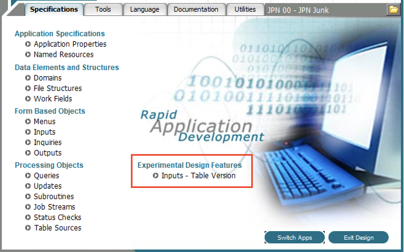
| < < | We are experimenting with a new interface for Application Design. If you set APPX_EXPERIMENTAL_PROCESS_DESIGN=true, then a new option will appear on the Application Design menu. While functional, it does not do everything the normal process design allows, ie, you cannot add new processes or delete existing ones. We are releasing it here as an experimental feature to get some feedback and suggestions. To send us feedback on this feature, email ' feedback@appx.com'. | |||||||
| > > | We are experimenting with a new interface for Application Design. If you set APPX_EXPERIMENTAL_PROCESS_DESIGN=true, then a new option will appear on the Application Design menu. While functional, it does not do everything the normal process design allows, i.e., you cannot add new processes or delete existing ones. We are releasing it here as an experimental feature to get some feedback and suggestions. To send us feedback on this feature, email ' feedback@appx.com'. | |||||||
| Changed: | ||||||||
| < < | If the environment variable is enabled, you will see the new option as below: | |||||||
| > > | If the environment variable is enabled you will see the new option as below: | |||||||
 | ||||||||
| Changed: | ||||||||
| < < | The current implementation for process design requires you to continually navigate from Processes -> Frames -> Images and back, which is time consuming. The new Table driven version allows you navigate directly from the Image level in one process to the Image level in a different process, for example. | |||||||
| > > | The current implementation for process design requires you to continually navigate from Processes -> Frames -> Images and back which is time consuming. The new Table driven version allows you navigate directly from the Image level in one process to the Image level in a different process, for example. | |||||||
| Changed: | ||||||||
| < < | When you click that option, you will see a display similar to this: | |||||||
| > > | When you click that option you will see a display similar to this: | |||||||
 | ||||||||
| Line: 218 to 216 | ||||||||
| Double clicking a process will allow you to edit that process using the original design input process. From there, you can navigate to the Frame and Image level as usual. | ||||||||
| Changed: | ||||||||
| < < | The other way to navigate to a frame or image is to click the 'Expand' button on the bottom. This will expand the selected process, or processes if you have selected more than one, and show all the frames and images: | |||||||
| > > | The other way to navigate to a frame or image is to click the 'Expand' button on the bottom. This will expand the selected process, or processes, if you have selected more than one, and show all the frames and images: | |||||||
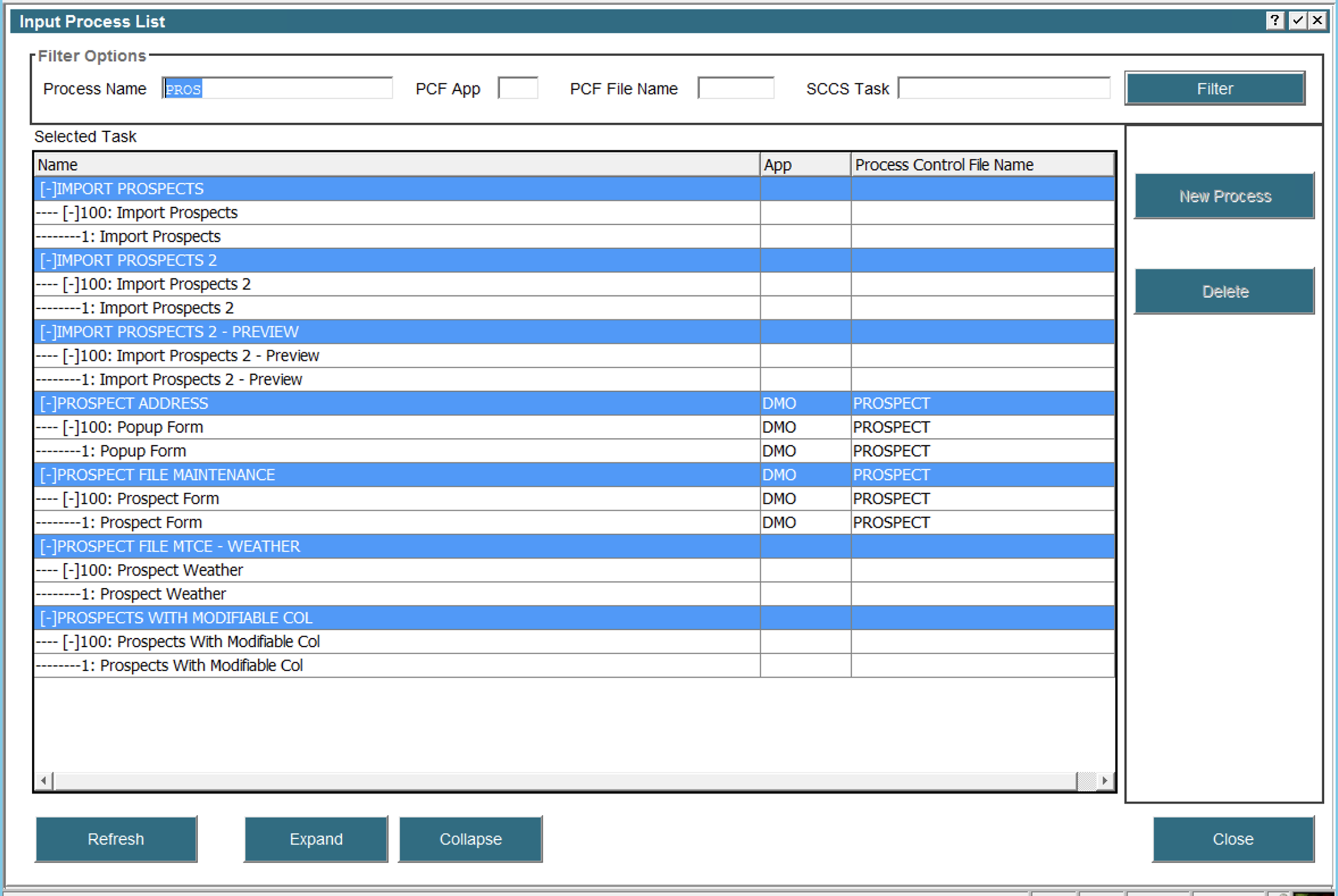 | ||||||||
| Changed: | ||||||||
| < < | In this example, I have used 'PROS' as a filter to only show inputs related to the Prospect file and I have expanded all of them. Now I can navigate directly to any Frame or Image via double click. A single click on any row will display the appropriate buttons in the right hand pane, ie, if I single click an Image, then an 'Image Editor' button will appear. Similarly, a single click on a Frame will display buttons for Automatic Children, and so on. | |||||||
| > > | In this example I have used 'PROS' as a filter to only show inputs related to the Prospect file and I have expanded all of them. Now I can navigate directly to any Frame or Image via double click. A single click on any row will display the appropriate buttons in the right hand pane, i.e., if I single click an Image then an 'Image Editor' button will appear. Similarly, a single click on a Frame will display buttons for Automatic Children and so on. | |||||||
| We welcome any suggestions on improving this interface. | ||||||||
View topic | History: r20 < r19 < r18 < r17 | More topic actions...
 Copyright © 2008-2024 by the contributing authors. All material on this collaboration platform is the property of the contributing authors.
 Ideas, requests, problems regarding TWiki? Send feedback