
Chapter 3-15: Using the GUI Image Editor
Painting Buttons
A button is used to provide users with a simple means of initiating an APPX process, function, or option. For example, the research button shown in the lower right-hand corner of Figure 3-15-1 allows users to quickly reference another process to perform Accounts Receivable research. You can add buttons to any menu or input process to enhance the functionality of the process.
After selecting the region in which you want to paint the button, the Button Properties overlay shown in Figure 3-15-9 appears. The information entered in this example produced the research button in Figure 3-15-1. When the user selects this button, the process defined as Option 99 in the Optional Child Processes for this image is executed.
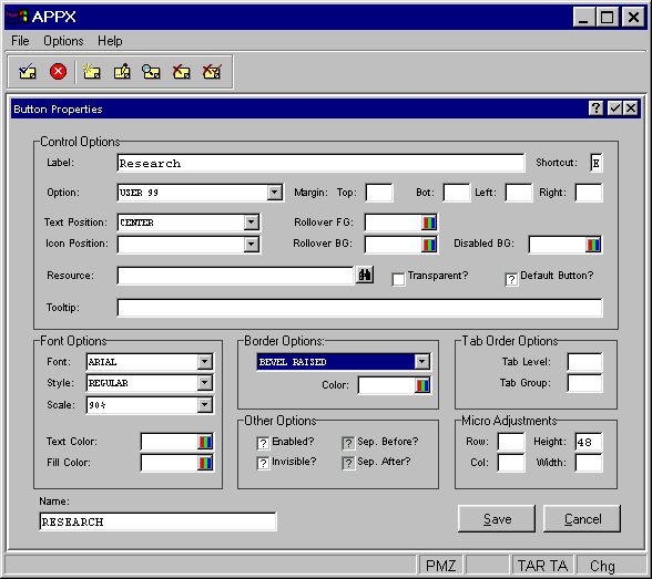

The Button Properties overlay contains several fields you can use to define the characteristics of your button:
Control Options
- Label
To label the button with the option, function, or process name.
- Shortcut
Defines a single key that serves as a shortcut to this button’s functionality.
- Option
To select a pre-defined APPX option or an option specific to the user or process. This option corresponds to a specific process defined in the Optional Child Processes for this image.
- Margin (Top, Right, Left, Bottom)
Are used to set extra margin space between the contents of the button and the border of the button. This value is in pixels and must be less than or equal to 255.
- Text Position
Indicates where the text should appear inside the button. Click the list
 button for a drop-down list of selections that include CENTER, TOP, RIGHT, BOTTOM, LEFT, UPPER RIGHT, UPPER LEFT, LOWER RIGHT and LOWER LEFT.
- Icon Position
Indicates where the defined icon (if any) should be placed in relation to the text inside the button. Click the list
button for a drop-down list of selections that include BEHIND TEXT, ABOVE TEXT, TRAILING TEXT, BELOW TEXT, LEADING TEXT, ABOVE & TRAILING, ABOVE & LEADING, BELOW & TRAILING, BELOW & LEADING and EXPAND TO FILL.- Rollover FG
Indicates the foreground color of this button when the mouse pointer is positioned over the button.
- Rollover BG
Indicates the background color of this button when the mouse pointer is positioned over the button.
- Disabled BG
Indicates the background color of this button when it has been disabled.
- Resource
To reference a group of bitmaps assigned in Application Design/Utilities that map specific images with button states (disabled, enabled, rollover, pressed, etc).
- Transparent Background?
Indicates whether or not the background of the button should be opaque or transparent.
- Tooltip
To define one line of help text that is displayed after the mouse pointer has been positioned over the button for a few seconds.
Font Options
- Font
To select the font (Arial, Courier, etc.) the button’s label is to be displayed with. Click the list
button to make your choice. If left blank, the default fault determined by your system administrator will be used.- Style
To select the label’s font style (bold, italic, etc.). Click the list
button to make your choice. If left blank, the regular font style is used.- Scale
To define the size of the label’s font as a percentage of the runtime font size. Click the list
button to make your choice.- Text Color
To define the label’s font color. Click the color icon and see the Making Color Selections section of Chapter 3-17, Graphical Attributes for detailed instructions.
- Fill Color
To define the button’s fill color. Click the color icon and see the Making Color Selections section of Chapter 3-17, Graphical Attributes for detailed instructions.
Border Options
- Type
To define the type of border that will surround the button. Click the list
button to make your choice.- Color
To define the color of the border. Click the color icon and see the Making Color Selections section of Chapter 3-17, Graphical Attributes for detailed instructions.
Other Options
- Enabled
Indicates whether or not the button is initially enabled for use when this image is first presented to the user. If "no" then the button must be enabled via ILF code in order for the user to be able to select it. Click the checkbox to toggle between "yes"
 and "no"
  values.
- Invisible
Indicates whether or not the button is initially invisible when this image is first presented to the user. If "yes" then the button must be made visible via ILF code in order for the user to be able to select it. Click the checkbox to toggle between "yes"
and "no" values.- Sep. Before?
Is not a valid option when defining an button and is disabled.
- Sep. After?
Is not a valid option when defining an button and is disabled.
Tab Order Options
- Tab Level
Defines the physical pass over the whole screen with respect to tab order. If left blank, this the button is considered to be in tab level 0. APPX will tab from top-left to bottom-right for all data objects in tab level 0. Then it repeats the sequence for all button objects in tab level 0. The cycle is repeated as necessary for each successive tab level. This behavior can be altered by the specification of Tab Groups.
- Tab Group
Is used to mark related fields and buttons so that they are grouped together as part of a tab order. When making a pass over the screen for a particular "Tab Level", if a field is encountered that has a non-null "Tab Group", then the tab order proceeds to all the fields and buttons that are part of that Tab Level/Tap Group. After reaching the last field or button in the group, the order will continue where it left off prior to entering the group. Note that for "Tab Groups", fields and buttons are consolidated into the same top-left to bottom-right pass.
Micro Adjustments
- Row, Col, Height and Width
Are entered as a percentage of an image cell (1 row x 1 column) and must be less than or equal to 100. These fields can be used to make slight adjustments to the size and position of the button.
Finally,
- Name
Allows you to “name” the button so it can be controlled (enabled, disabled, etc). via ILF statements.
When you have finished defining the button you have two options available to you:
- Select the save option on the bottom right corner of the screen to save the definition and return to the Image Editor.
- Or, you can select the cancel option to discard the new definition or changes to an existing definition, and then return to the Image Editor.