


Chapter 3-17: Graphical (GUI) Attributes
Defining Graphical Attributes for Validation and Token Table Entries
Validation and token table entries can be displayed with a variety of graphical attributes. You can use icons to represent each entry in the table, if desired. Different font types, styles, scales, colors and alignments can also be used to add visual attributes to your table entries instead of displaying them all in the default manner. The Graphical Attributes overlay is accessed from the Validation Table or Token Table overlays available in Database Management for alpha, format, or token type domains, fields, and work fields. A sample Validation Table overlay for an alpha field is shown in Figure 3-17-10.
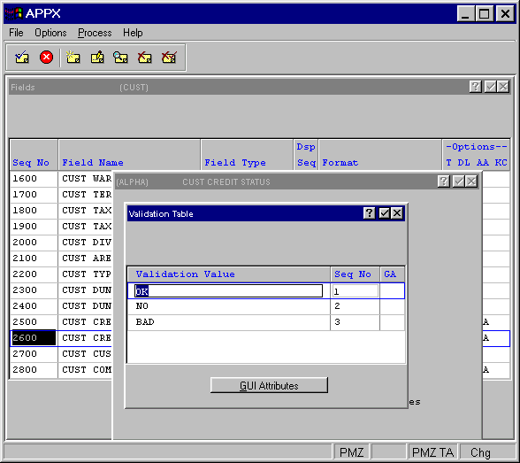
Figure 3-17-10. Validation Table Overlay in Database Management (Files)
For each Validation or Token table entry, select the gui attributes option from the table overlay to access the Graphical Attributes overlay shown in Figure 3-17-11.
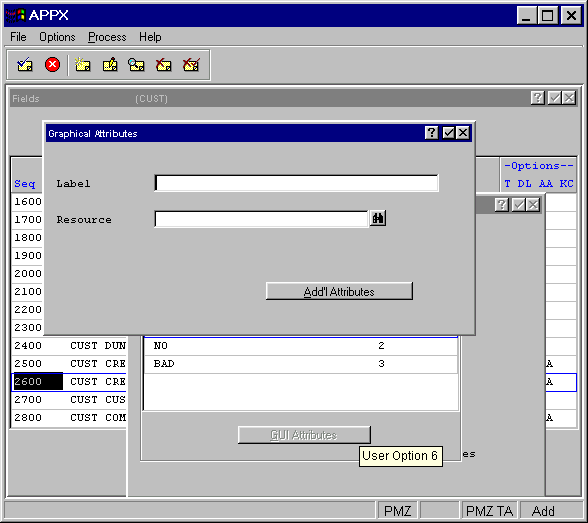
Figure 3-17-11. Graphical Attributes Overlay For Validation and Token Table Entries
This overlay contains these fields:
·
Label labels the graphic with the table entry name. The Label is displayed when
the user selects the list  button to view a list of available field values. If no Label is entered, APPX displays the only
the validation value.
button to view a list of available field values. If no Label is entered, APPX displays the only
the validation value.
· Resource identifies the resource for the optional icon, button or other graphic. Select the scan icon for a list of available resources. The ENABLED state of the named resource identifies the actual name of the graphic file. See Chapter 1-8, Utilities for more information on defining Named Resources.
To make change the default font, color and alignment attributes, select the add'l attributes option on the Graphical Attributes overlay. This overlay is shown in Figure 3-17-12.
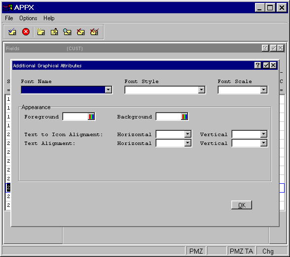
Figure 3-17-12. Graphical Attributes Additional Attributes Overlay For Validation and Token Table Entries
These fields can be defined on the Additional Attributes overlay:
·
Font Name identifies the font ( Courier, Arial, etc.) to be used for the title. Click the
list
button to select your choice. If left blank, the system default determined by your system administrator
is used.
·
Font Style identifies the font style (bold, italic, etc.) to be used for the title. Click
the list
button to select your choice. If left blank, a regular font style is used.
·
Font Scale indicates a percentage by which to scale the default size of this font (50%,
150%, etc.). Click the list
button to select your choice. If left blank, a default of 100% is used.
Appearance
· Foreground Color indicates the color of the label text. You can enter a specific color name or click the color selection icon to make the color selection. See the Making Color Selections section for more details.
· Background Color indicates the color of the label background. You can enter a specific color name or click the color selection icon to make the color selection. See the Making Color Selections section for more details.
·
Text to Icon Alignment (Horizontal and Vertical) indicates how the label text should be
aligned in respect to the optional icon defined for this table entry. Click the list
button to view a list of selections.
·
Text Alignment (Horizontal and Vertical) indicates how the text should be aligned within
the table row. Click the list
button to view a list of selections.
When you have finished defining the additional attributes, click the ok button located on the bottom right corner of the overlay to save your entry.
APPX Application
Design Manual (01/13/03)
© 2003 by APPX Software, Inc. All rights reserved