


Chapter 3-17: Graphical (GUI) Attributes
Defining Graphical Attributes For Optional Child Processes
Because Optional Child Processes can appear in one or more places (pull-down menu, right-click context menu, etc.), graphical attributes can be defined to control how and where available optional child processes are listed on menu or input images. The Graphical Attributes overlay for Optional Child Processes is accessed from the Optional Child Processes overlay shown in Figure 3-17-6. Graphical Attributes must be defined individually for each Optional Child process you define. They cannot be defined globally for all optional processes defined for a process.
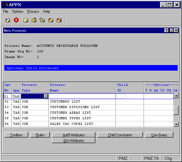
Figure 3-17-6. Optional Child Processes Overlay for a Menu Process (from Figure 3-17-2)
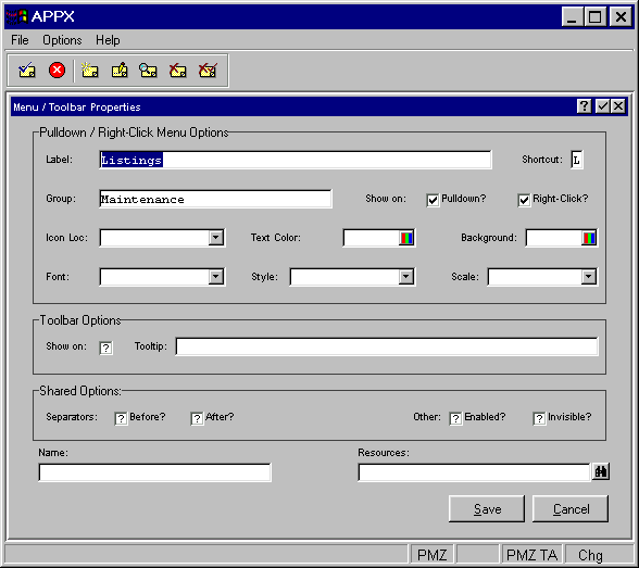
Figure 3-17-7. Optional Child Graphical Attributes Overlay (Figure 3-17-6 Option 51)
When selecting the GUI Attributes option from either a menu process or input process image, the Graphical Attributes overlay shown in Figure 3-17-7 appears. These attributes are available to define:
Pulldown/Right-Click Menu Options
Ę Label is the descriptive text which appears on the menu or input image. If left blank, the descriptive name of the process invoked is used.
Ę Shortcut is a single key on the keyboard that when pressed in conjunction with the alt key, invokes this optional child process. The first occurrence of this key in the Label text will be underlined to tell the user what the shortcut key is. For example, if the Label is Customers and the Shortcut is C, then the Label will display as Customers.
Ę Group refers to either the top-level name which appears on the pull-down menu or the Label of a previously defined child so that a cascading menu can be defined. In the example shown in Figure 3-17-1, all three items (File Maintenance, Listings, Other Utilities) on the Maintenance pull-down have a group designation of Maintenance as shown in Figure 3-17-7. Then, all ten of the items listed on the Listings pull-down menu have been assigned to the group Listings (as shown in Figure 3-17-8). Because Maintenance is the first level, there is no group designation defined as shown in Figure 3-17-9. Grouping these different menus in a multi-tiered fashion creates the cascade effect shown in the example. Items appear sequentially across the title bar from left to right and within the pull-down menus according to the Optional Process Number you assign to each process.
Ę
Show on Pull Down Menu? indicates if this optional child process should be displayed as
a pull down menu. Click the checkbox to toggle between "yes"  and "no"
  .
.
Ę
Show on Right-Click Menu? indicates if this optional child process should be displayed as
a right-click, context menu. Click the checkbox to toggle between "yes"
and "no" .
Ę
Icon Location indicates where the icon should be placed in relation to the Label.
Click the list  button to select from either LEADING or TRAILING.
Ę Text Color indicates the color of the label text. You can enter a specific color name or click the color selection icon to make the color selection. See the Making Color Selections section at the end of this chapter for more details.
Ę Background Color indicates the color of the label background. You can enter a specific color name or click the color selection icon to make the color selection. See the Making Color Selections section at the end of this chapter for more details.
Ę
Font identifies the font ( Courier, Arial, etc.) to be used for the title. Click the list
button to select your choice. If left blank, the system default determined by your system administrator
is used.
Ę
Style identifies the font style (bold, italic, etc.) to be used for the title. Click the
list
button to select your choice. If left blank, a regular font style is used.
Ę
Scale indicates a percentage by which to scale the default size of this font (50%, 150%,
etc.). Click the list
button to select your choice. If left blank, a default of 100% is used.

Figure 3-17-8. Final Level of a Cascading Pull-Down Menu (Figure 3-17-6 Option 52)
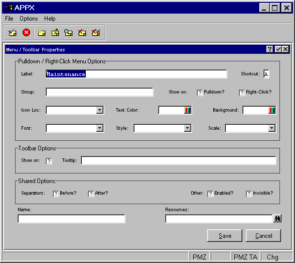
Figure 3-17-9. First Level of a Cascading Pull-Down Menu
Tool Bar Options
Ę Show On indicates if this optional child will appear graphically on the tool bar. Note that if you define a graphical representation for this item (an icon, for example), then a resource with an enabled state icon must be specified in order for this child to appear on the tool bar.
Ę Tooltip is 60 characters of help text that you can enter. The tooltip is displayed to users as a "hover over" when the mouse pointer is passed over the respective icon.
Shared Options
Ę
Separator Before? indicates if a separator line should be placed before this optional process
label to better segregate labels into logical groups. Click the checkbox to toggle between "yes"
and "no" .
Ę
Separator After? indicates if a separator line should be placed after this optional process
label to segregate labels into logical groups. Click the checkbox to toggle between "yes"
and "no" .
Ę
Enabled? Indicates if this icon or button should initially be enabled and available for
use by the user. The icon or button can also be enabled or disabled through the use of ILF code that
references the Name field. Click the checkbox to toggle between "yes"
and "no" .
Ę
Invisible? indicates whether this icon or button should initially be invisible to the user.
The icon or button can also be made visible or invisible through the use of ILF code that references the
Name field. Click the checkbox to toggle between "yes"
and "no" .
Finally,
Ę Name is the name assigned to this GUI Attribute. The name is used for controlling the GUI object with ILF code so that, for example, certain selections could be disabled by user id.
Access to the GUI attributes at runtime with ILF code is done via the --- WIDGET file. The WIDGET records from the process are copied into this file and are available in the Pre-Display event point. WIDGET NAME is a key to this file. You can read and rewrite records in this file to affect the GUI attributes at runtime for the current frame only.
Ę Resource identifies auxiliary files (such as image files) that are used as part of the GUI object specified by these controls. For example, when defining this Optional Child button or icon , the resource identifies the image file to use. The resources associated with an application are found in the menu path:
Application Design/Utilities/Named Resources
When you have finished defining the graphical attributes for this image, you must save or cancel the attributes by selecting either the save or cancel options located in the bottom right of the screen.
APPX Application
Design Manual (01/13/03)
® 2003 by APPX Software, Inc. All rights reserved