
Chapter 3-16: Using GUI Features of the Image Editor
Defining Graphical Attributes for Image Fields
Image fields can also be displayed with a variety of graphical attributes. You can use a variety of Widgets to represent certain field types. You can also display the contents of a field using different fonts, font styles, colors, and other attributes.
From the Edit Item overlay, you select the GUI Attributes option to display the GUI Attributes overlay used to define the GUI Attributes. There are several different overlays, one for each field type defined in the data dictionary. Common to each is the Control field. The type of Control which can be selected is directly associated with the type of field that was placed on the image. Once a Control is selected, the appropriate fields will open for further refinement. Most of these attribute settings can be set dynamically using ILF coding techniques and the --- WIDGET file.
Alpha Item:
Contol Type can be BUTTON, LABEL, PICTURE, RAW TEXT, LISTBOX, PASSWORD, FILE CHOOSER, COLOR CHOOSER.
Note: The PICTURE Control Type replaces the PICTURE ILF Statement.
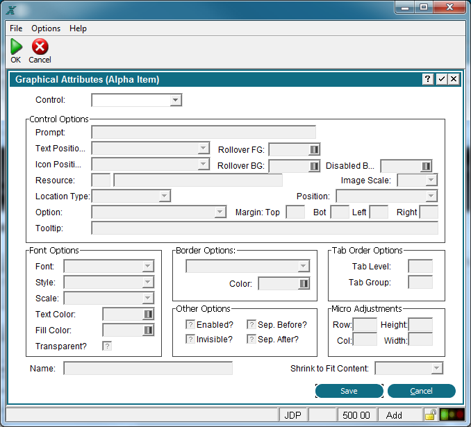
Graphical Attributes Overlay For Alpha Item
Date Item:
Contol Type can be LABEL, RAW TEXT, CALENDAR/CLOCK.
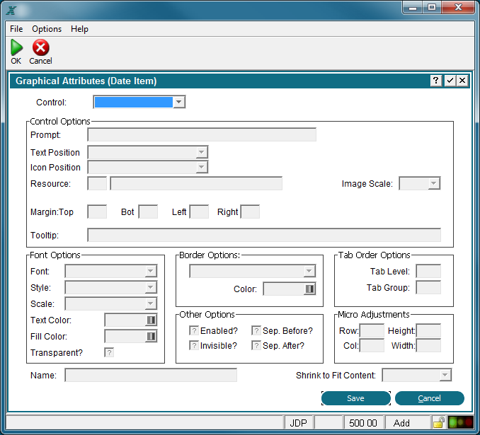
Graphical Attributes Overlay For Date Items
Logic Item:
Contol Type can be LABEL, RAW TEXT, CHECK BOX, TOGGLE BUTTON.

Graphical Attributes Overlay For Logic Items
Numeric Item:
Contol Type can be LABEL, RAW TEXT, SLIDER, PROGRESS BAR.

Graphical Attributes Overlay For Numeric Items
Text Item:
Contol Type can be LABEL, RAW TEXT, TEXT AREA, HTML VIEWER, RTF VIEWER.

Graphical Attributes Overlay For Text Items
Some or all of these fields can be defined on the overlay depending on the type of field you are defining attributes for:
Control indicates the graphical representation of this field. Choices vary by field type but can include:
Button to display an option button on the screen.
Label to display descriptive information.
Picture to display images.
Raw Text to indicate no graphical representation.
Calendar/Clock to allow the user to select a date from a calendar.
List Box to list allowable value for the field.
Password to display redacted characters as they are typed.
File Chooser to display the desktop file system allowing the user to select a previous stored file.
Color Chooser to select colors from the desktop pallet.
Slider to display a slider bar for setting a variable.
Progress Bar to show the user the progress of running a process.
Text Area to provide a two dimensional box to enter text with word wrapping.
Check Box to display logic fields as a checkbox that toggles from 'yes'  to 'no'
  and, optionally, to "unknown"
  (if entry is not required), (Y, N or blank using Character Mode).
Toggle Button to display logic fields as a button that toggles from 'yes'  to 'no'
  "unknown" is treated as a 'no').
HTML Viewer to display text fields in a scrolling edit box.
RTF Viewer to display text fields in a scrolling edit box.
Control Options are described in the Image Field Control Options section.
Font Options are described in the Image Field Font Options section.
Border Options are described in the Image Field Border Options section.
Other Options are described in the Image Field Other Options section.
Tab Order Options are described in the Image Field Tab Order Options section.
Micro Adjustments -- Row, Col, Height and Width are entered as a percentage of an image cell (1 row x 1 column) and must be less than or equal to 100. These fields can be used to make slight adjustments to the size and position of the data object.
Name is the name assigned to the GUI Attributes for this item and can be used to access the attributes at runtime as described below. You can then control the GUI object with ILF code so that, for example, certain selections could be disabled by user ID.
Access to the GUI attributes at runtime with ILF code is done via the --- WIDGET file. The WIDGET records from the process are copied into this file and are available in the Pre-Display event point. WIDGET NAME is a key to this file and can be set to the value specified in Name. You can read and rewrite records in this file to affect the GUI attributes at runtime.